‘consistent and thoughtful application across multiple platforms builds a stronger brand presence’
Multichannel branding
As a design studio, we help keep brands alive by ensuring their message, tone, and visual identity are consistent across all channels. This helps build trust and familiarity with a brand.
Our range of applications is as diverse and unique as the brands we create. Here’s some examples:


Brand evolution
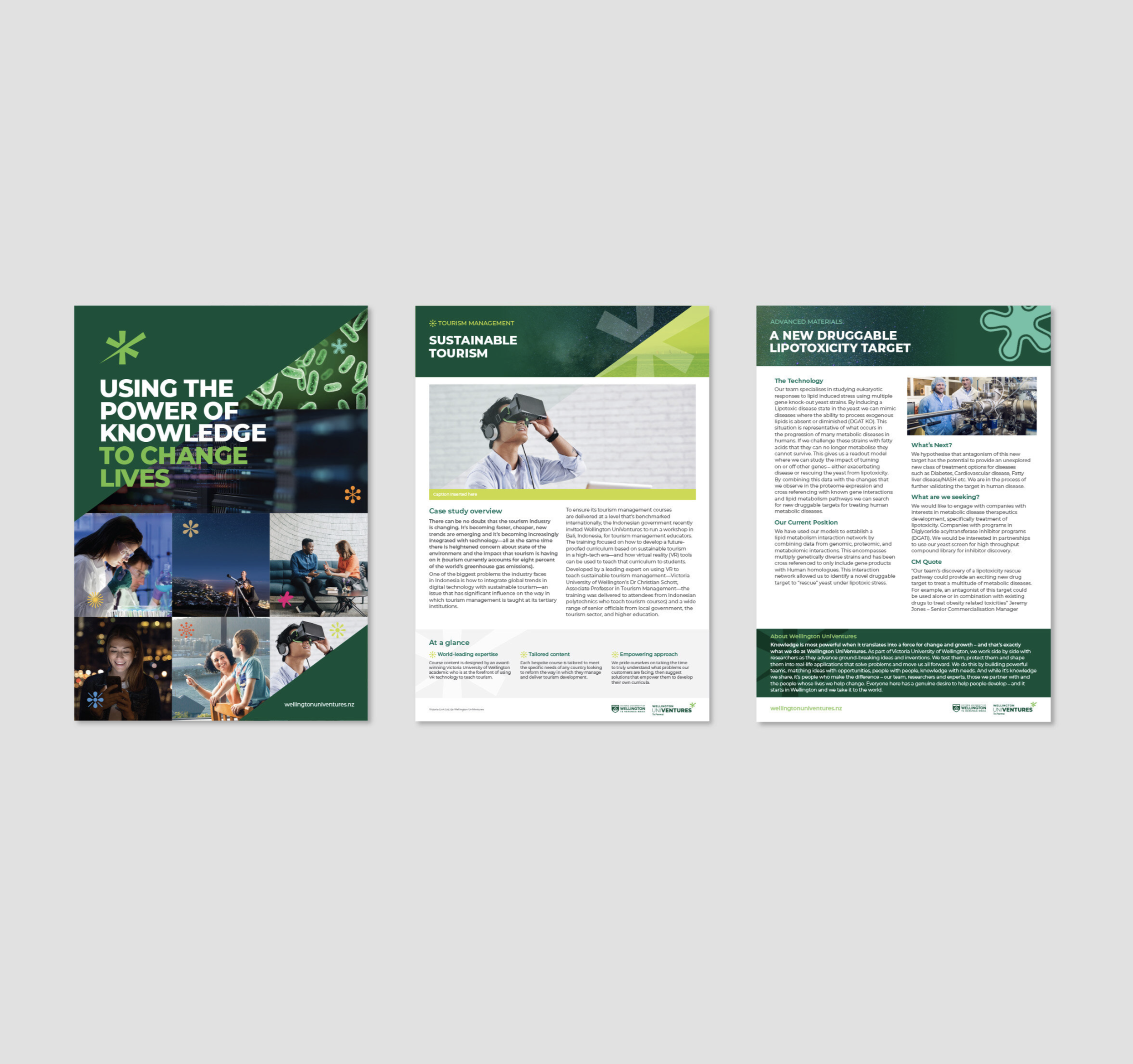
Wellington UniVentures Te Paewai
Viclink (the tech transfer arm for Victoria University of Wellington) rebranded to become ‘Wellington UniVentures’. We were responsible for the entire rebrand, from workshops to name generation. This strategy formed the brief for the logo and brand look and feel. Each application echoes the values of integrity, adaptability, ambition and collaboration. Brand applications included leading the design and messaging in a complex website redesign, designing flyers, fact sheets, videos, digital EDMS, merchandise applications, and office interiors, as well as a range of user-friendly templates that staff could use.
READ MORE >>


Brand evolution – strategy, identity development and concept
PPTA Te Wehengarua
SCENARIO was asked to evolve the PPTA brand to reflect a modern, dynamic, and professional union. The new logo was supported by six tohu, each inspired by carefully selected tukutuku panel designs. Various digital and print items were created for this rebrand. These ranged from core stationery and templates to sub-brands, campaigns and signage.
READ MORE >>


Brand evolution
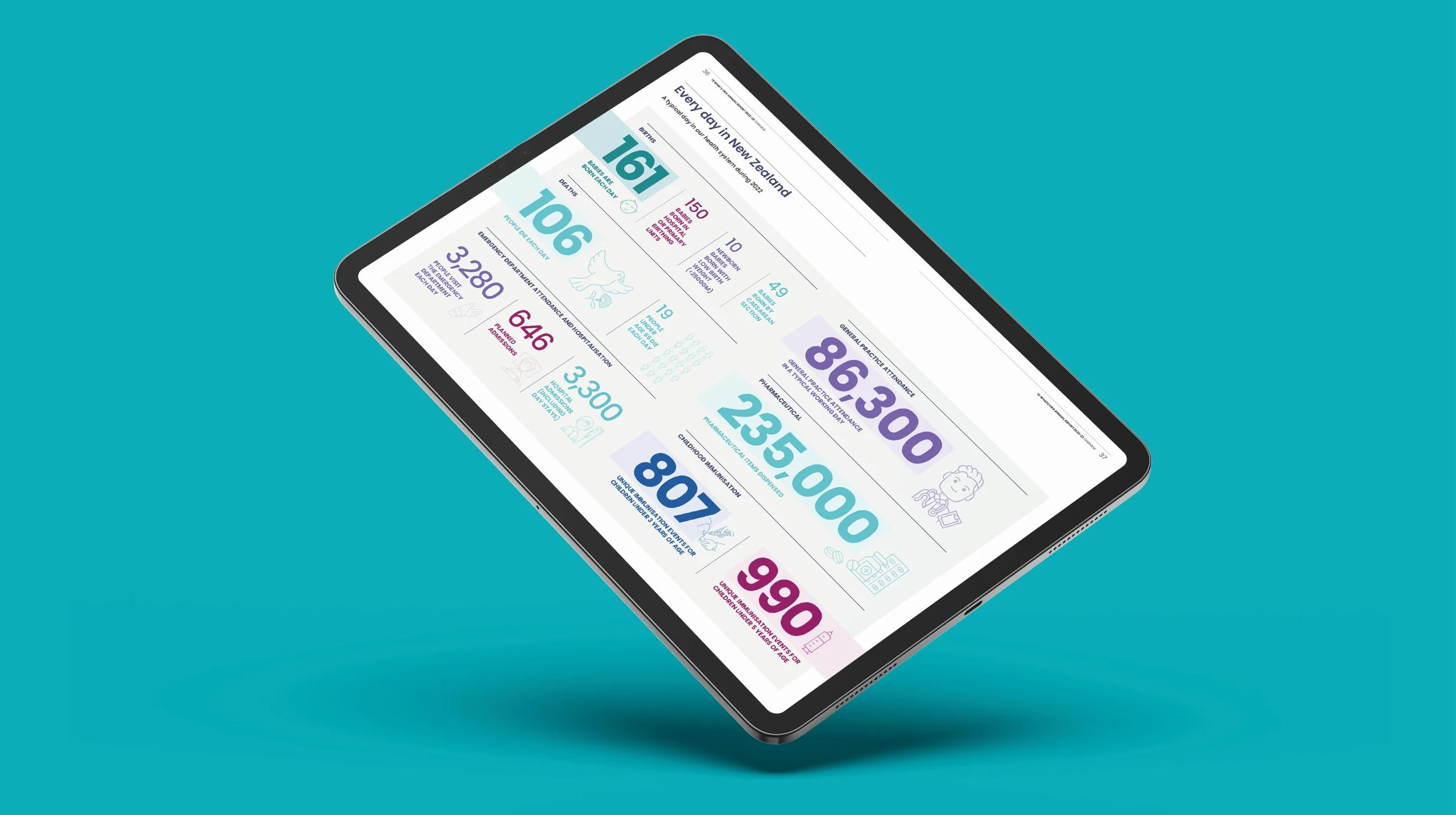
Ministry of Transport | Te Manatū Waka
A recently redesigned website and the Ministry’s kaupapa created the need for this brand evolution. Guided by a Māori strategist, this mahi included a revised publication system, an evolved logo, and a range of other applications – from PowerPoint templates and business cards to interior graphics, social media templates and signage.
READ MORE >>


Brand evolution
Master Builders
Everything we do reflects the Master Builders’ purpose of ‘Building a Better New Zealand’. This brand stands for quality, offering members support and delivering value. These are the conceptual foundations for every digital and printed item we create. Applications included advertising, public and member-facing collateral, events, campaigns, signage, and everything in between.
READ MORE >>


Identity development
Health New Zealand
SCENARIO designed the original (interim) logos for Te Whatu Ora (Health New Zealand) and Te Aka Whai Ora (Māori Health Authority). Both identities tell a unique story. Te Whatu Ora is ‘the weaving of wellness’ – bringing strands together to weave a basket; a basket of life. Te Aka Whai Ora is inspired by Te Waka Hourua – the double-hulled canoe. Each identity was intentionally simple (consisting of only a logo and a tohu for each entity). A broad range of digital and print items was created. This was then adapted in-house, and SCENARIO continues to assist on various projects.
READ MORE >>


Brand strategy, concept and identity
DM&Co.
The Darvill Mellors & Co. brand appropriately emphasises the ampersand ‘&’ as this not only denotes the concept of going further, but also strongly suggests collaboration and added value. The imagery (of 'Wellington on a good day’) is suggestive of a financial journey – feeling good with DM&Co. by your side. Design applications included photography, a website, collateral, merchandise, and signage.
READ MORE >>


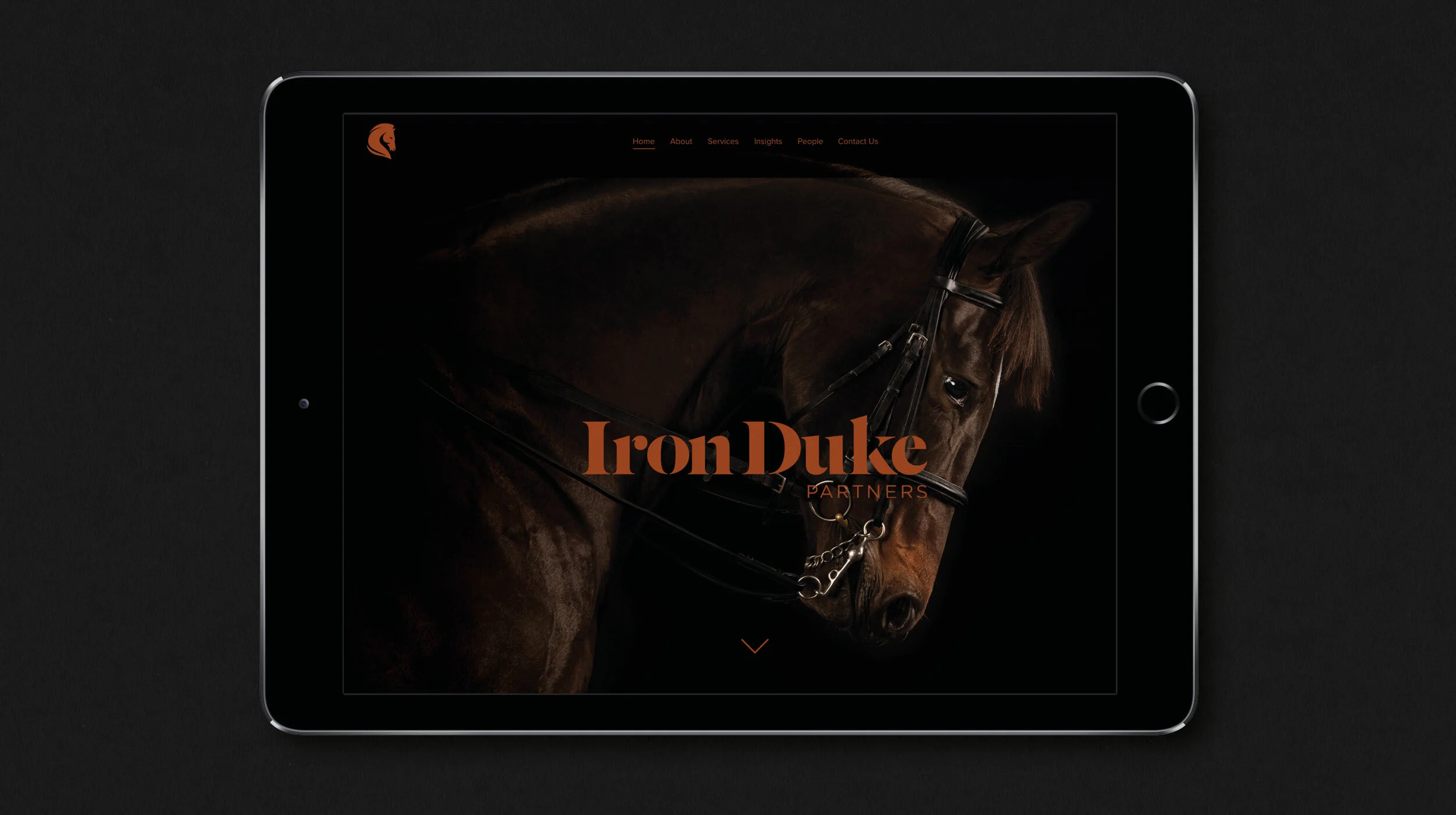
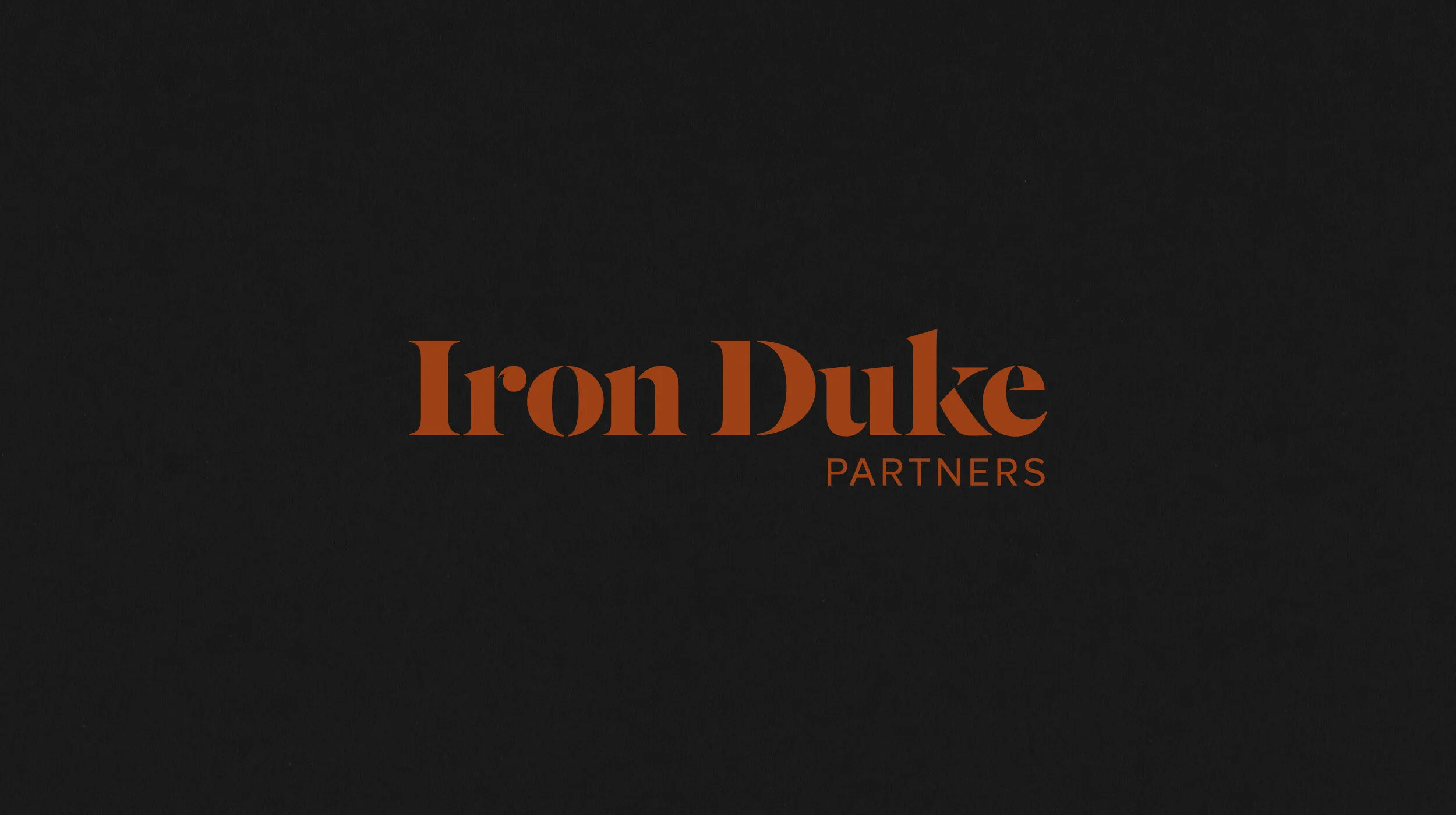
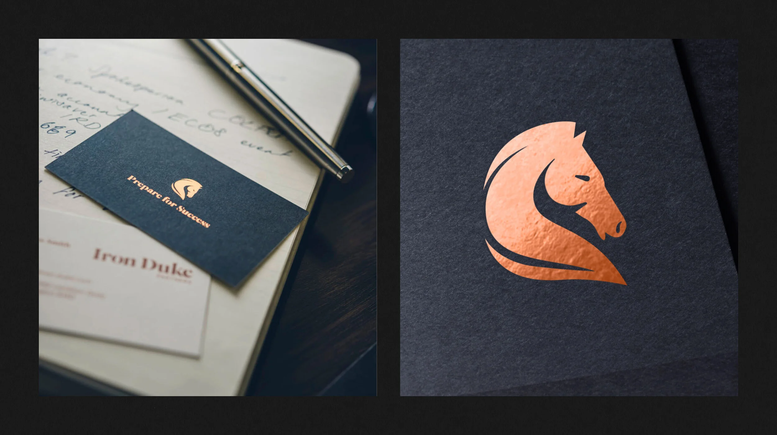
Brand creation
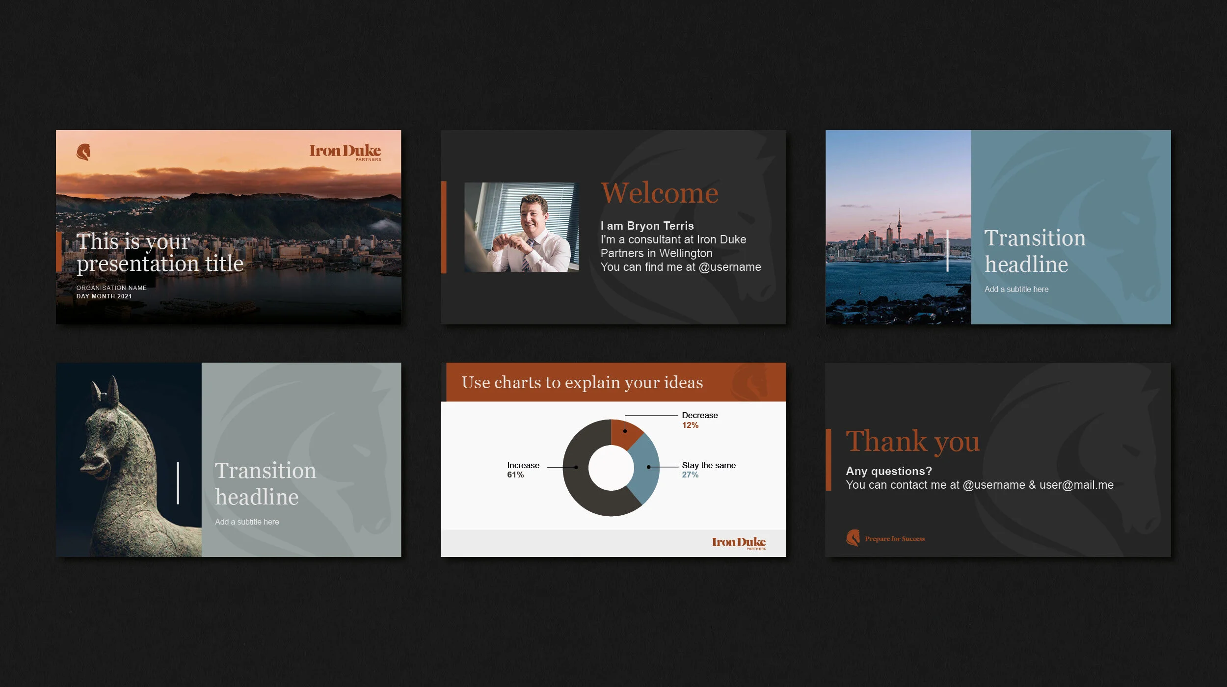
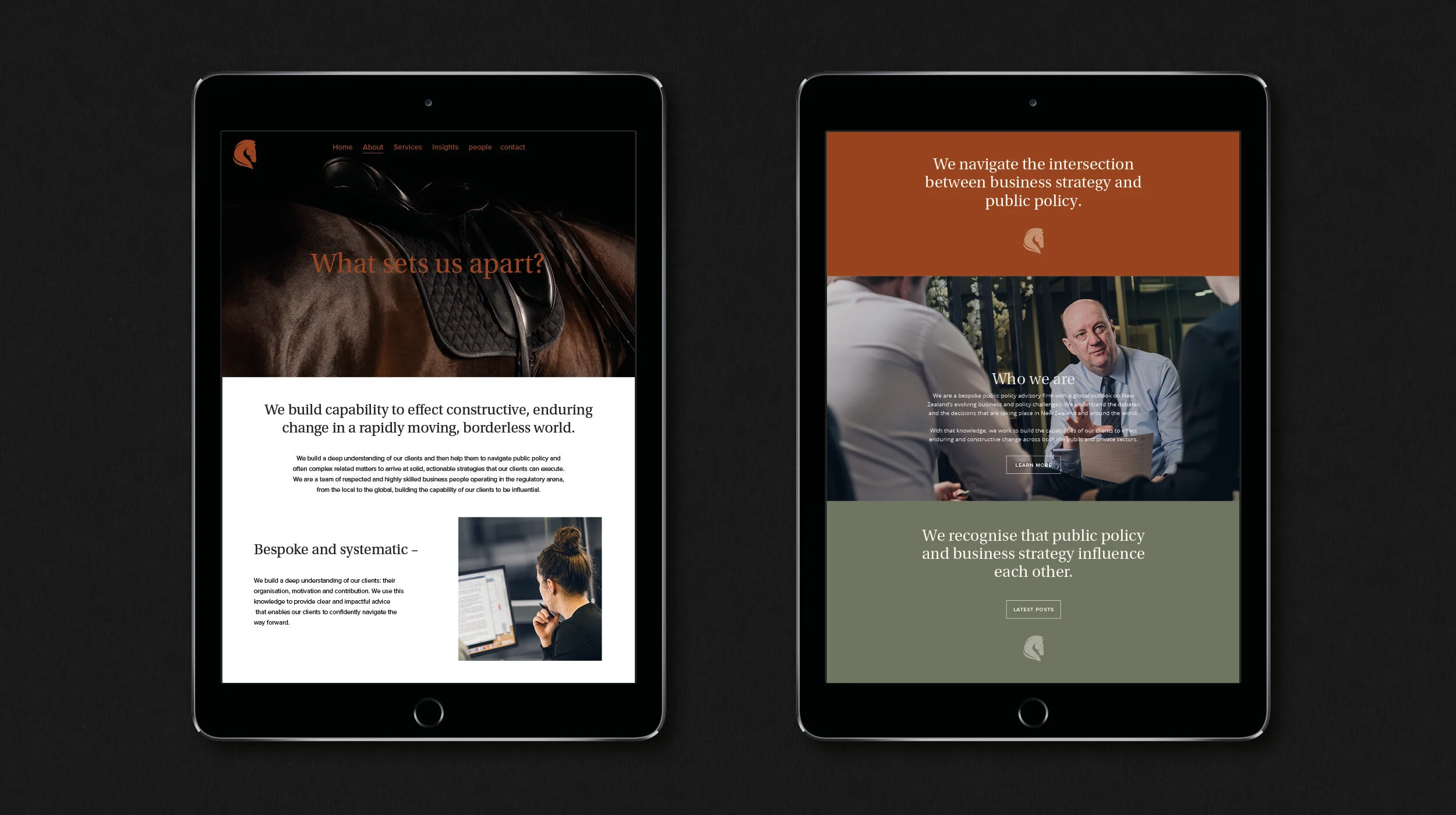
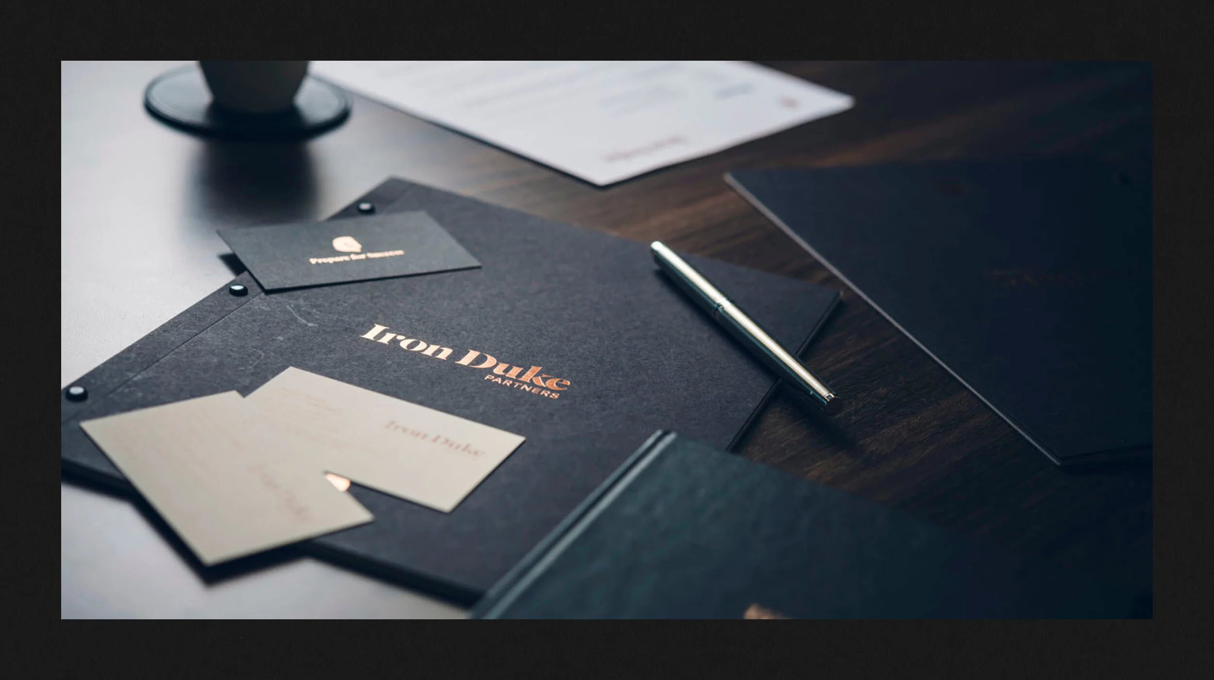
Iron Duke Partners
Iron Duke is a New Zealand government relations and public policy advisory firm. The concept behind this identity was based on the Battle of Waterloo (where the Duke and his horse, Copenhagen, formed a strong, reliable partnership. The horse then became a symbol of the Duke’s resilience and strength). Applications included photography, a website, collateral, and signage.
READ MORE >>
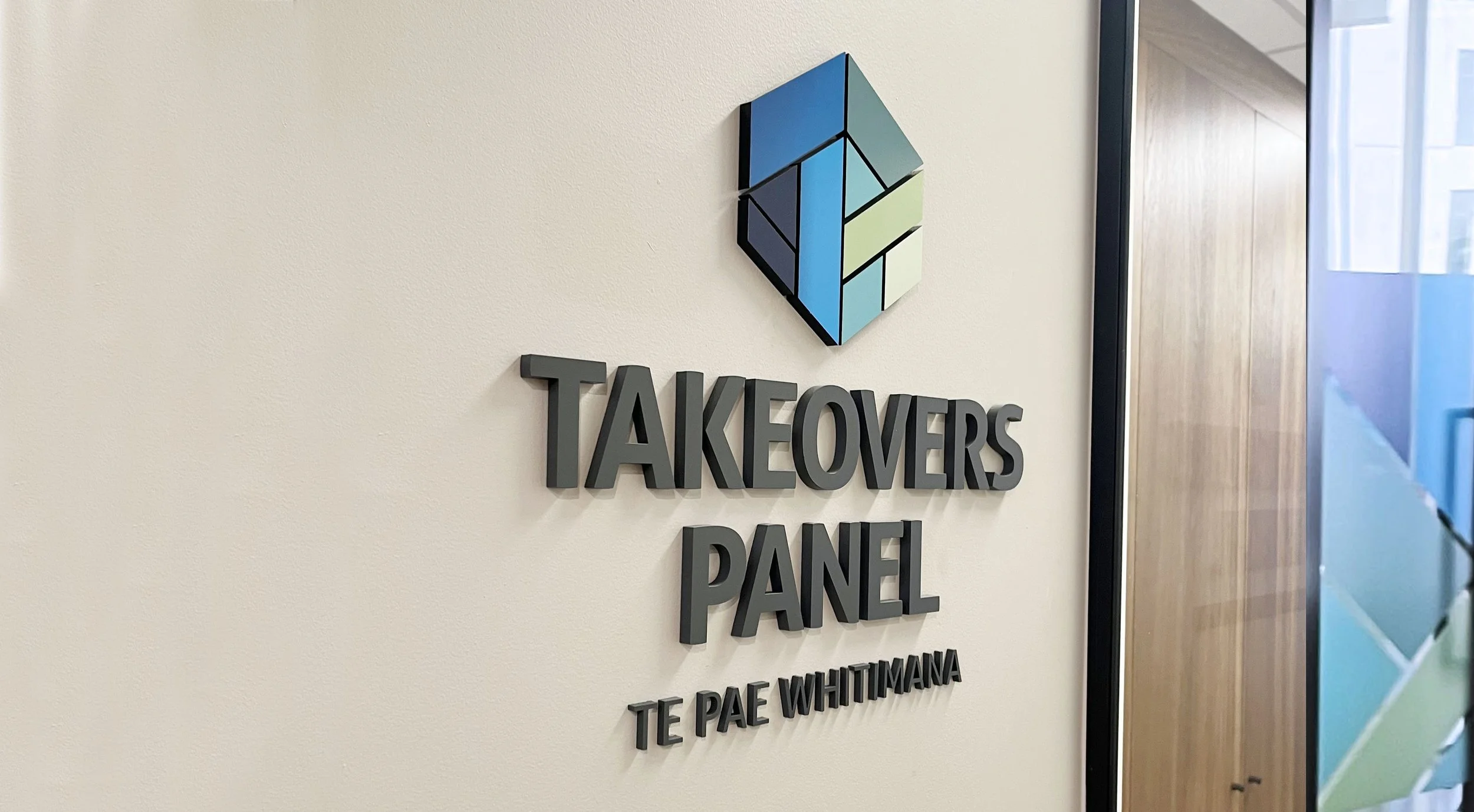
Brand strategy, identity development and concepts
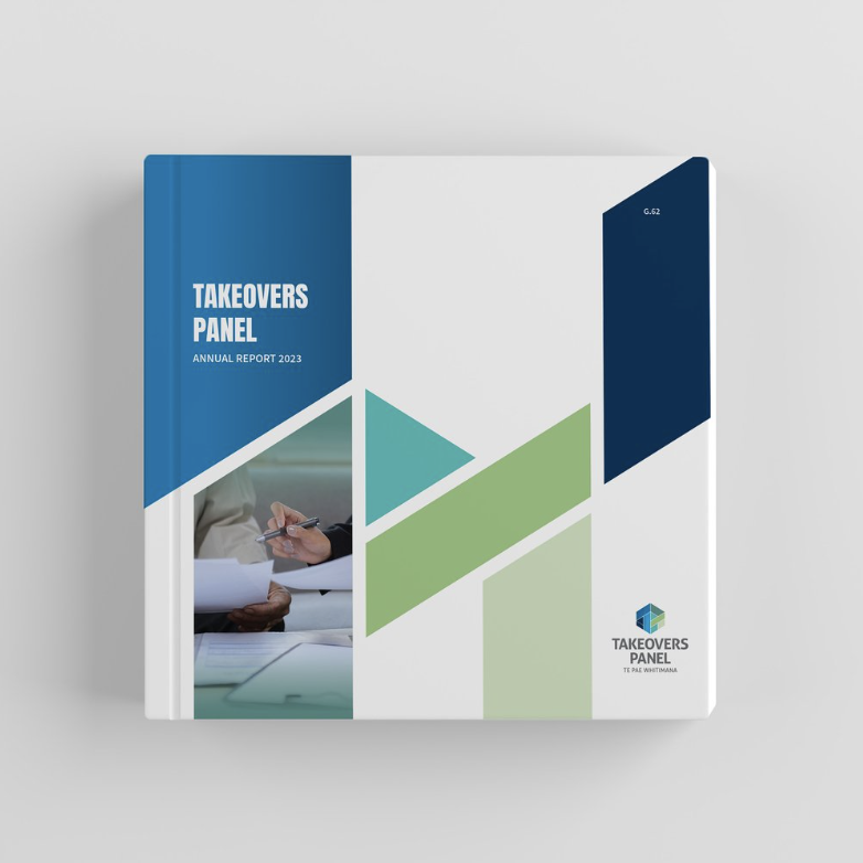
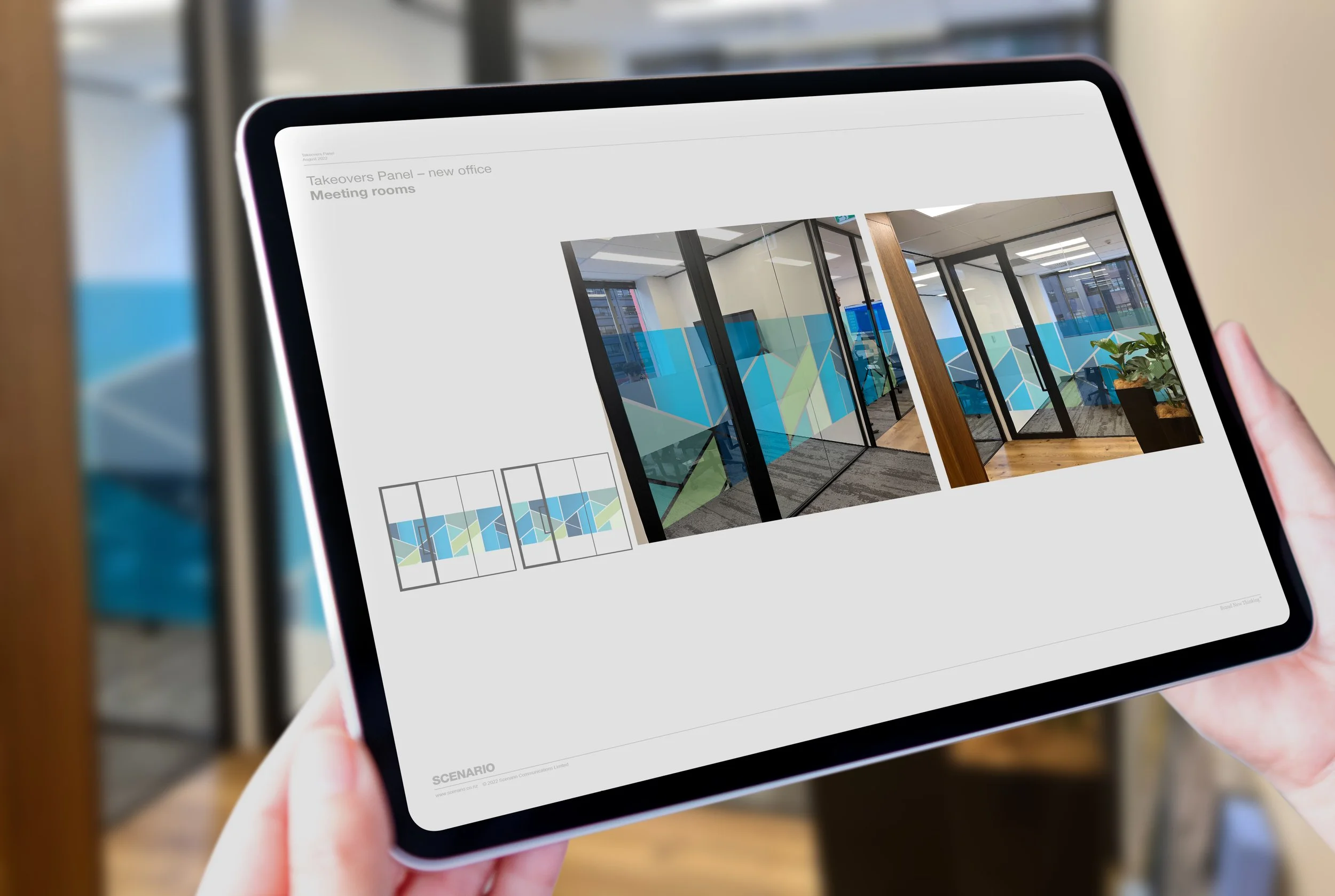
Takeovers Panel
The Takeovers Panel sought a brand refresh that would support its position as a regulator and help communicate the important messages that guide and shape an effective and fair takeovers market. A unique, robust, and cohesive system to take the Panel forward was developed (with the subtle TP in the logo marque). Various digital and print items were created. These included stationery, digital templates, leading the website design, and signage, as well as EDMs.
READ MORE >>