‘from badges and banners to billboards and buses’
From coated metallic samples to AI style formatting – we’re old-school trained, combined with new tech-savvy. But nothing is fully automated. You still need to understand the content to take the reader on a journey, and design with the end-user and the final output in mind.
And when it comes to printing, we’ve produced a wide spectrum of items – each with its own production peculiarities. This experience is invaluable, as it provides peace-of-mind that we can deliver.
The following examples cover a broad range of printed documents, with a few other printed applications sprinkled in.


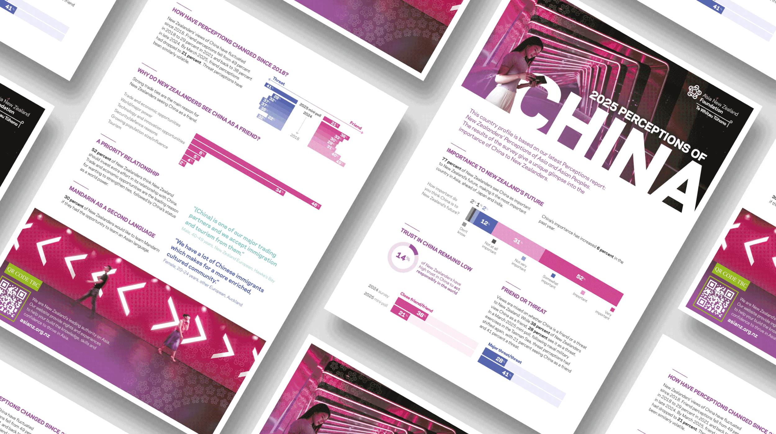
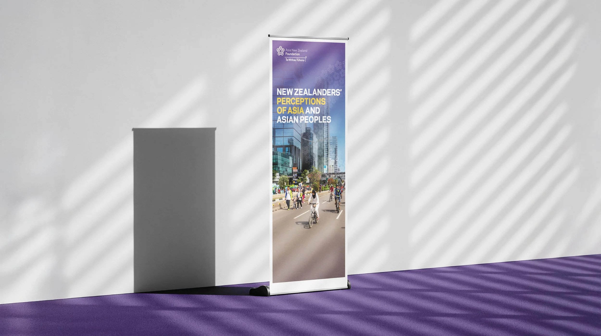
Yearly survey report – Perceptions of Asia
Asia New Zealand Foundation Te Whītau Tūhono
This report is the Foundation’s flagship longitudinal survey. The design builds on previous years, with the navigation, hierarchy and document structure evolved to enhance engagement and accessibility. Printed elements ranged from the main report (PUR-bound with spot UV) to summary sheets, from country-specific flyers to printed pull-up banners and mini flyers. Supporting digital assets were also provided.

Annual Report
Forest Growers Association
We developed this clean contemporary design to conceptually represent a sector that is growing upwards. This report was digitally printed. Supporting digital assets were also provided.


Internal safety campaign
CentrePort Wellington
CentrePort is committed to achieving a Zero Harm goal for all people entering or working on our site. This campaign, developed and designed by SCENARIO, brings this vision to life. This is a great case study to demonstrate the variety of printed items that are possible beyond printed documents. The campaign took many forms – from printed stickers to signage, doormats, packaging, interior design, notepads, pull-up banners, and bags.


Monthly magazines
Horticulture New Zealand
These cleverly designed layouts were efficient to populate, allowed the ads to shine, and were visually appealing to the reader. The magazines are offset printed and occasionally accompanied by inserts. Digital assets were also provided.
READ MORE >>


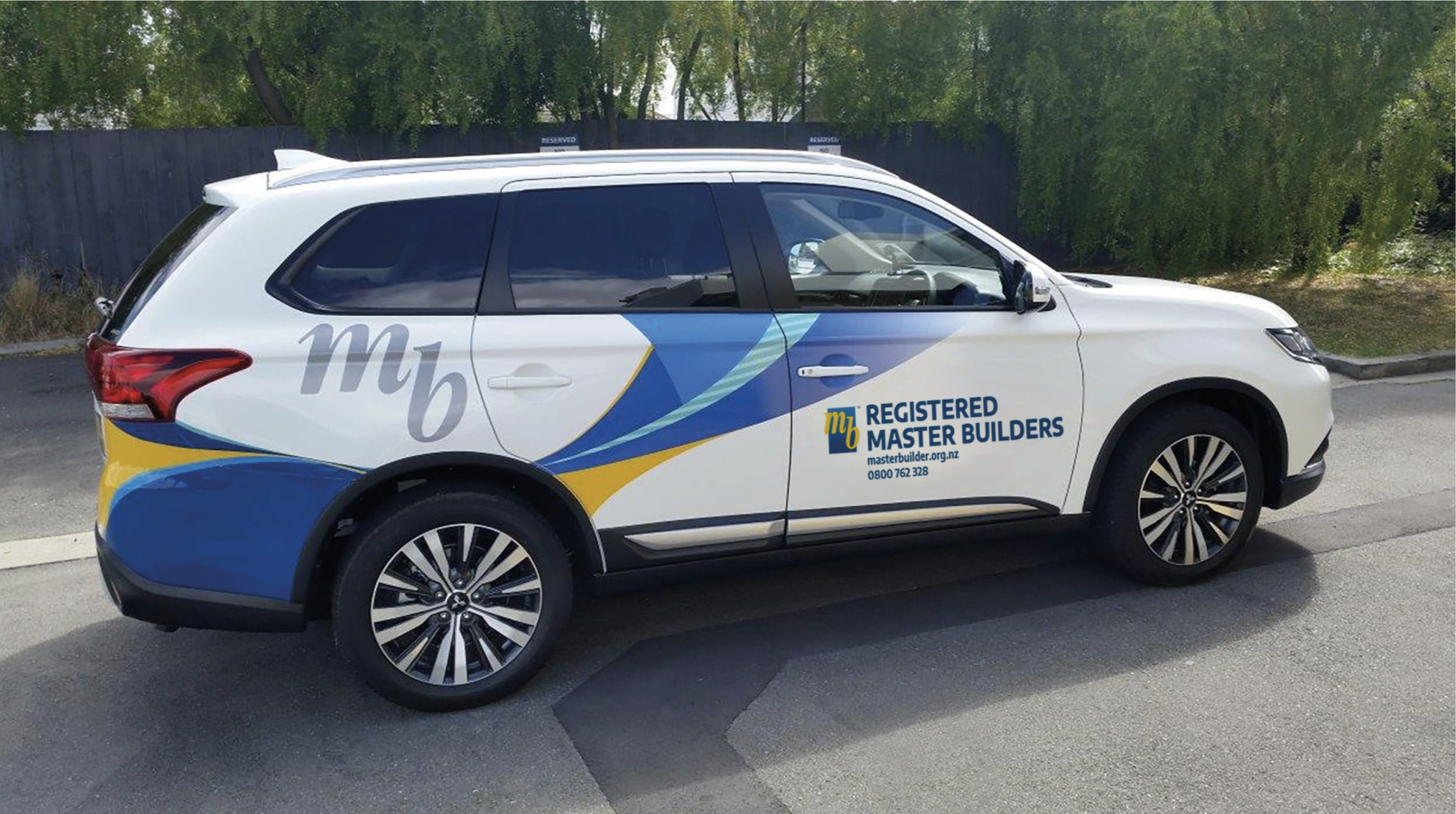
Brand collateral
Master Builders
Various print items have been designed and created to reflect Master Builders’ purpose of ‘Building a Better New Zealand’. This brand stands for quality and delivering value, which is reflected in a variety of printed items, ranging from certificates and posters to flyers, advertisements, magazine inserts, event collateral, and vehicle graphics.
READ MORE >>


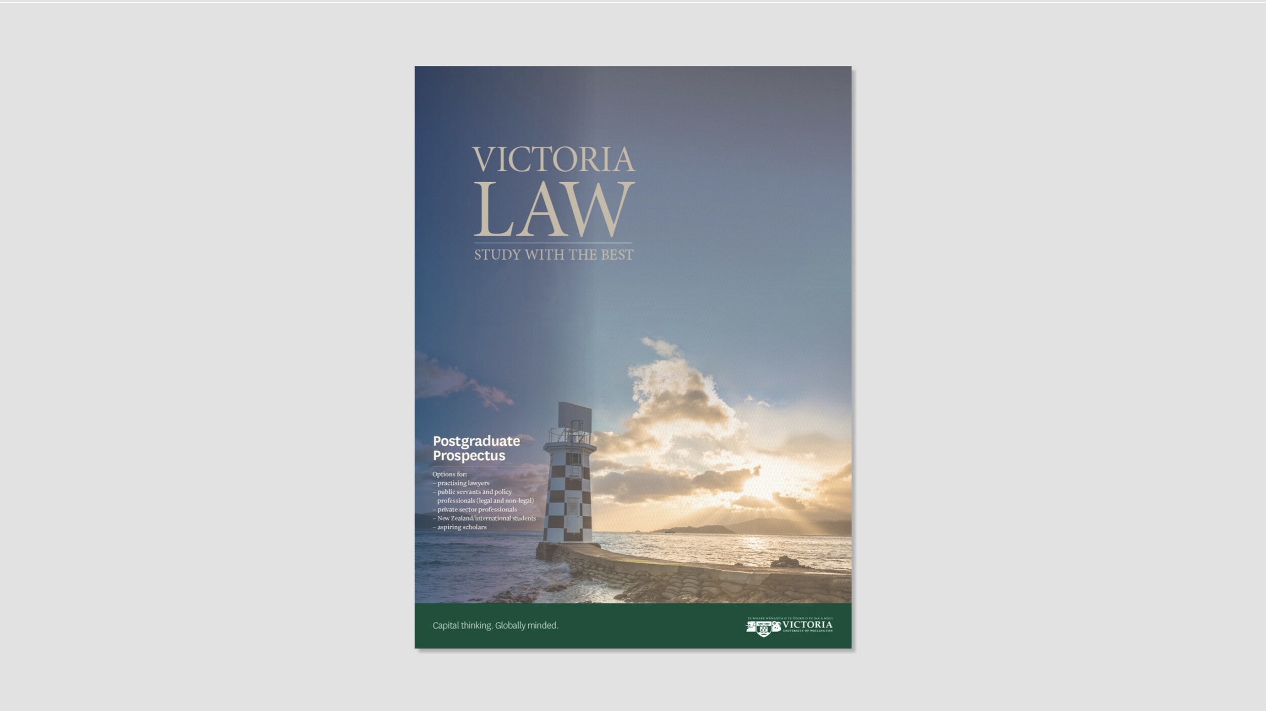
Law Faculty collateral
Victoria University of Wellington (Te Herenga Waka)
We designed a new look and feel for the Law Faculty’s collateral that was sophisticated, elegant, and filled with pride. This collateral features Wellington icons throughout (as one key audience is alumni, we wanted to create a nostalgic, Wellington feeling, which was almost ethereal, and brings back fond memories of being a law student). The printed items included V.Alum (the annual magazine for alumni and friends), prospectuses, flyers, banners, and exhibition event materials.


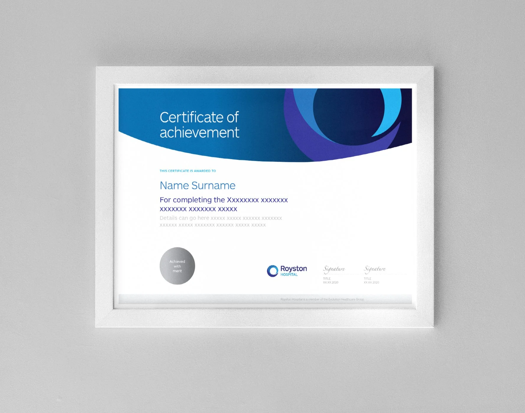
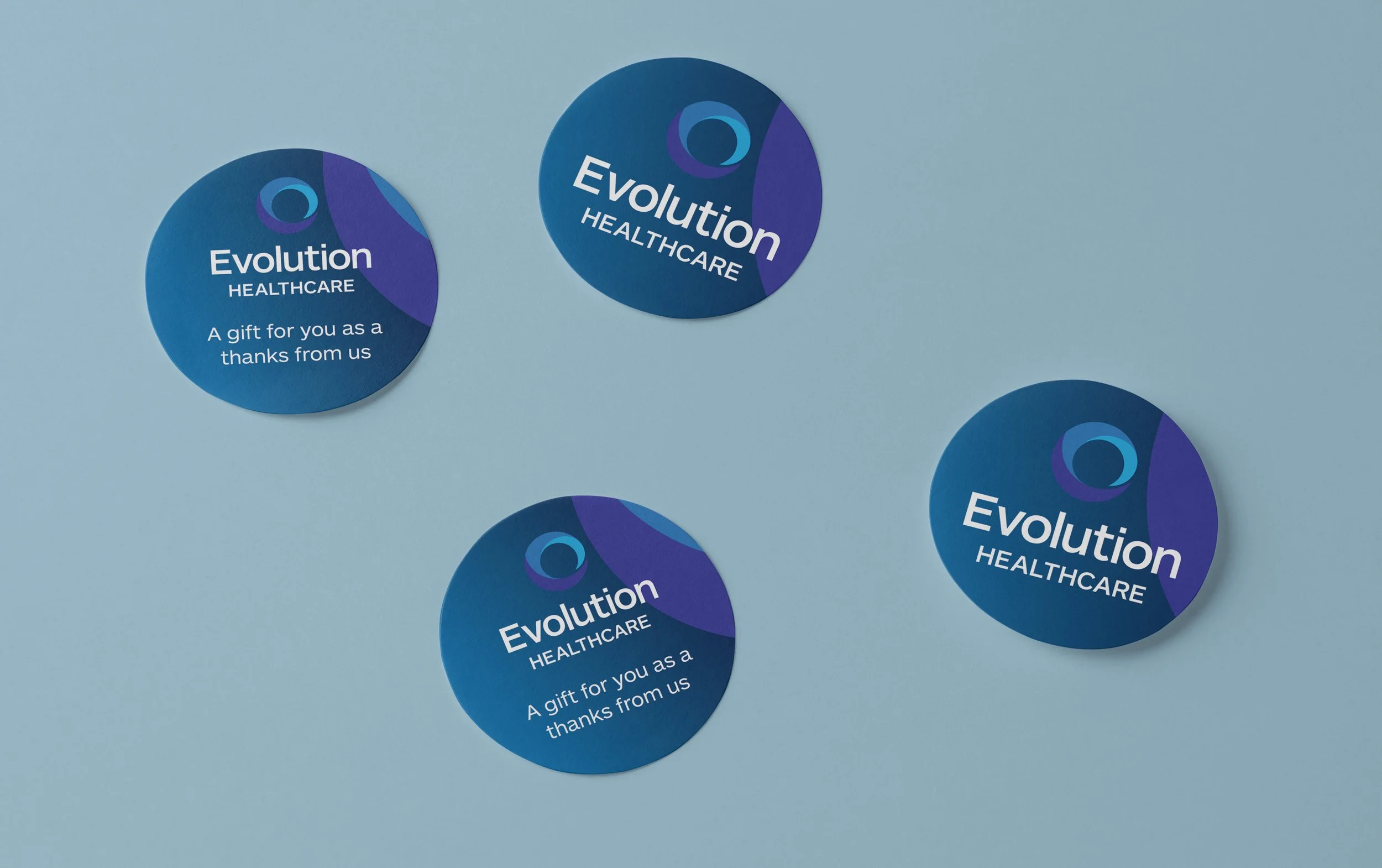

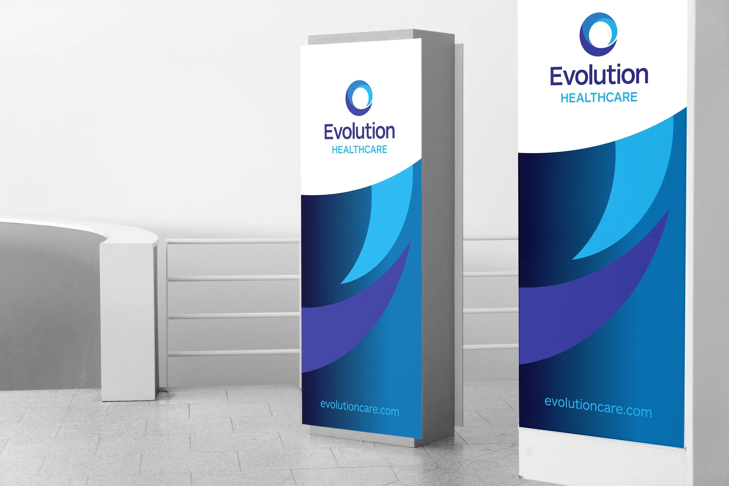
Brand applications
Evolution Healthcare
We designed a range of printed collateral for Evolution Healthcare, which was guided by the brand style and the purpose of ‘Enhancing the health, recovery and wellbeing of New Zealanders’. These ranged from core stationery and signage to promotional magazines, event materials, and items specific to key stakeholders.


Annual Report
Horticulture New Zealand
’Rising to the challenge’ was the concept that inspired the layout, imagery, structure and content in this Annual Report. The document was digitally printed, and supporting digital assets were also provided.
READ MORE >>


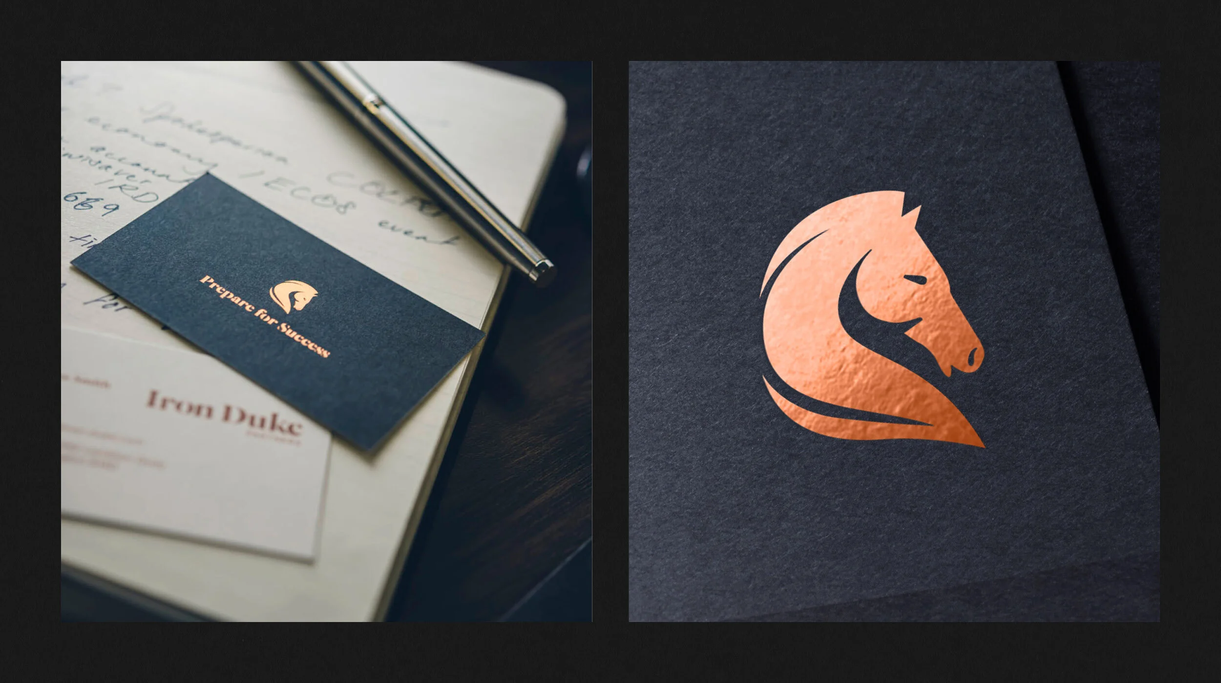
Brand applications
Iron Duke
The concept behind this identity was based on the Battle of Waterloo (where the Duke and his horse, Copenhagen, formed a strong, reliable partnership. The horse then became a symbol of the Duke’s resilience and strength). The Iron Duke brand exudes quality at every turn, from the creative elements and execution to the choice of materials and the production values. For example, foil-stamped business cards on premium stock, a unique bound welcome book, through to producing a beautiful, heavy burnished metal office sign and bespoke frosted glass graphics.
READ MORE >>


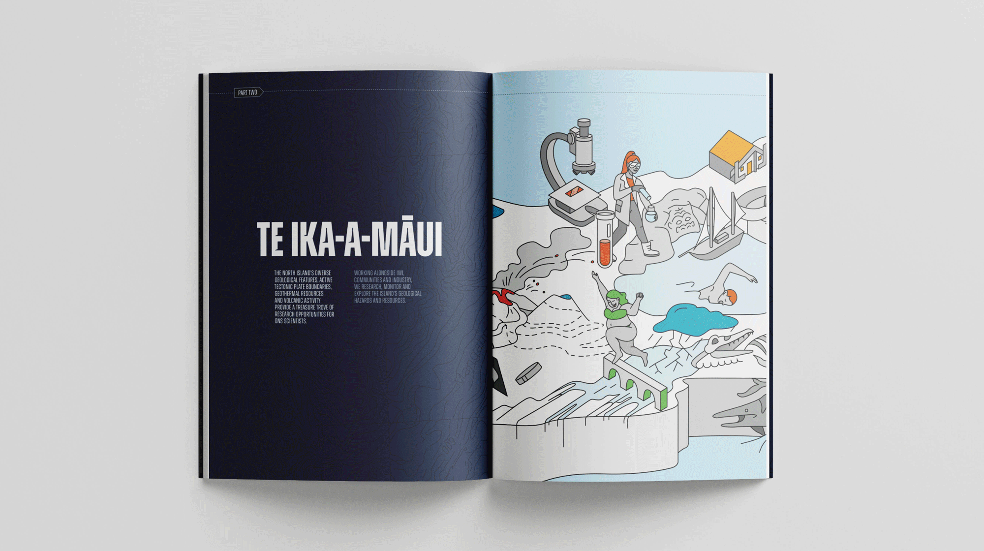
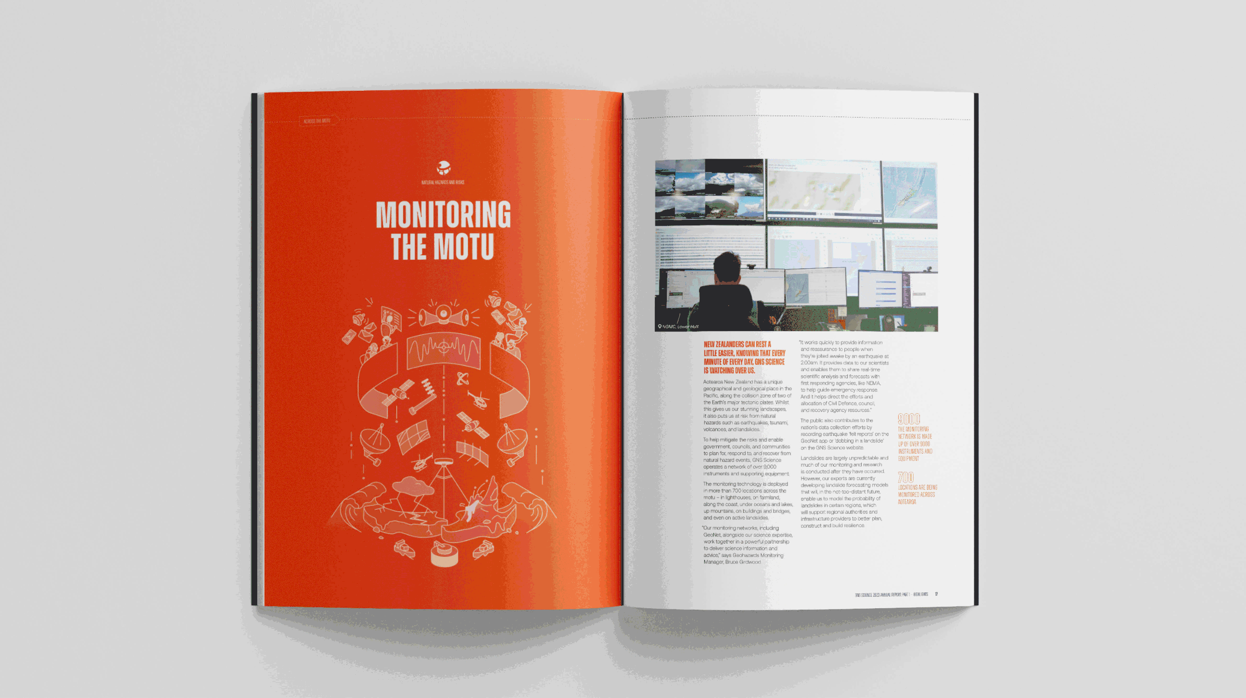
Conceptual Annual Report
GNS Science, Te Pū Ao
The concept for this report was based on ‘science that matters’ across the motu, as the document was to be shared in a national roadshow. The design vision was also to make complex science engaging and straightforward for a wide range of audiences. To achieve this, playful and informative illustrations were introduced, including a map of the range of work across the motu. The report was digitally printed, PUR-bound, and contained an engaging double-fold-out introduction. Supporting digital assets were also provided.
READ MORE >>