‘building up builders
and the industry’
Multichannel brand – Master Builders
About
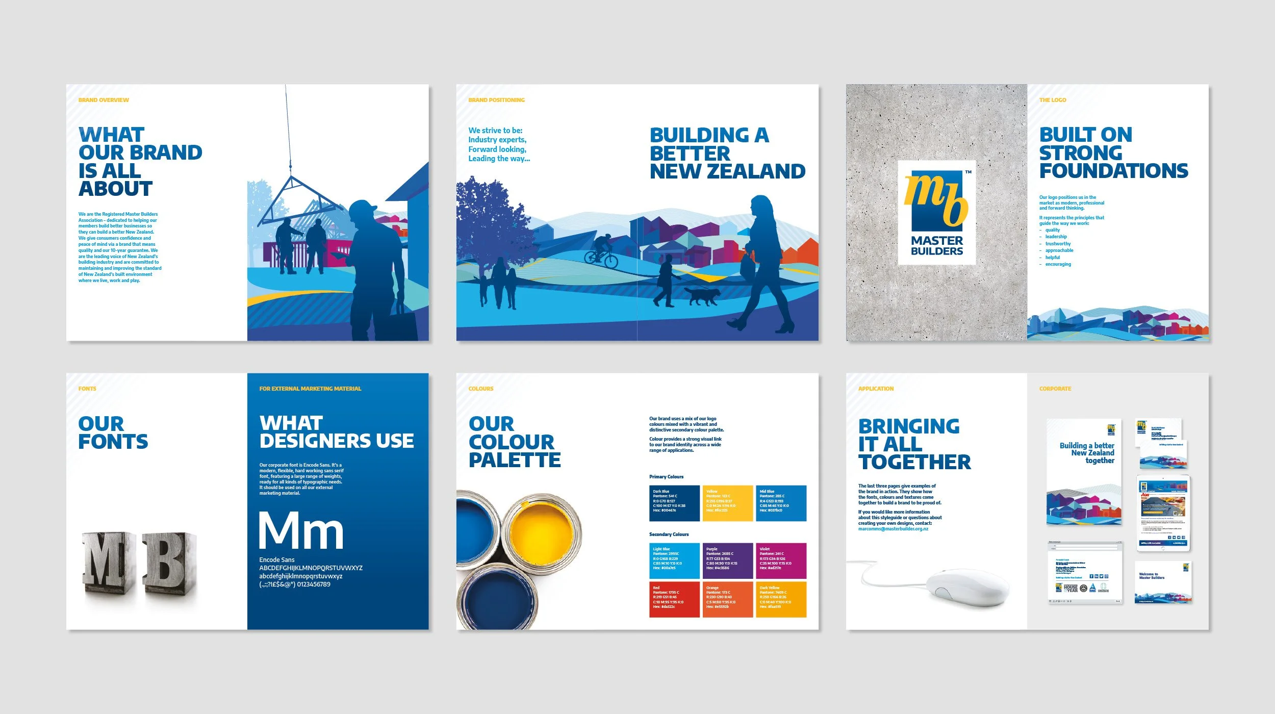
Master Builders has been a part of New Zealand’s construction landscape for over a hundred years, with 95% of consumers recognising the brand (from a recent survey). To stay relevant to its members and consumers in an ever-changing market, they wanted to ‘renovate’ their brand to look fresher, more modern and approachable.
With such a recognisable logo used by construction companies across the country, a full redesign was neither appropriate nor practical, but we were tasked with modernising the core logo and refreshing the application of the master brand.
Approach
The typography in the logo marque was modernised and simplified, and a gradient was added to the containing box.
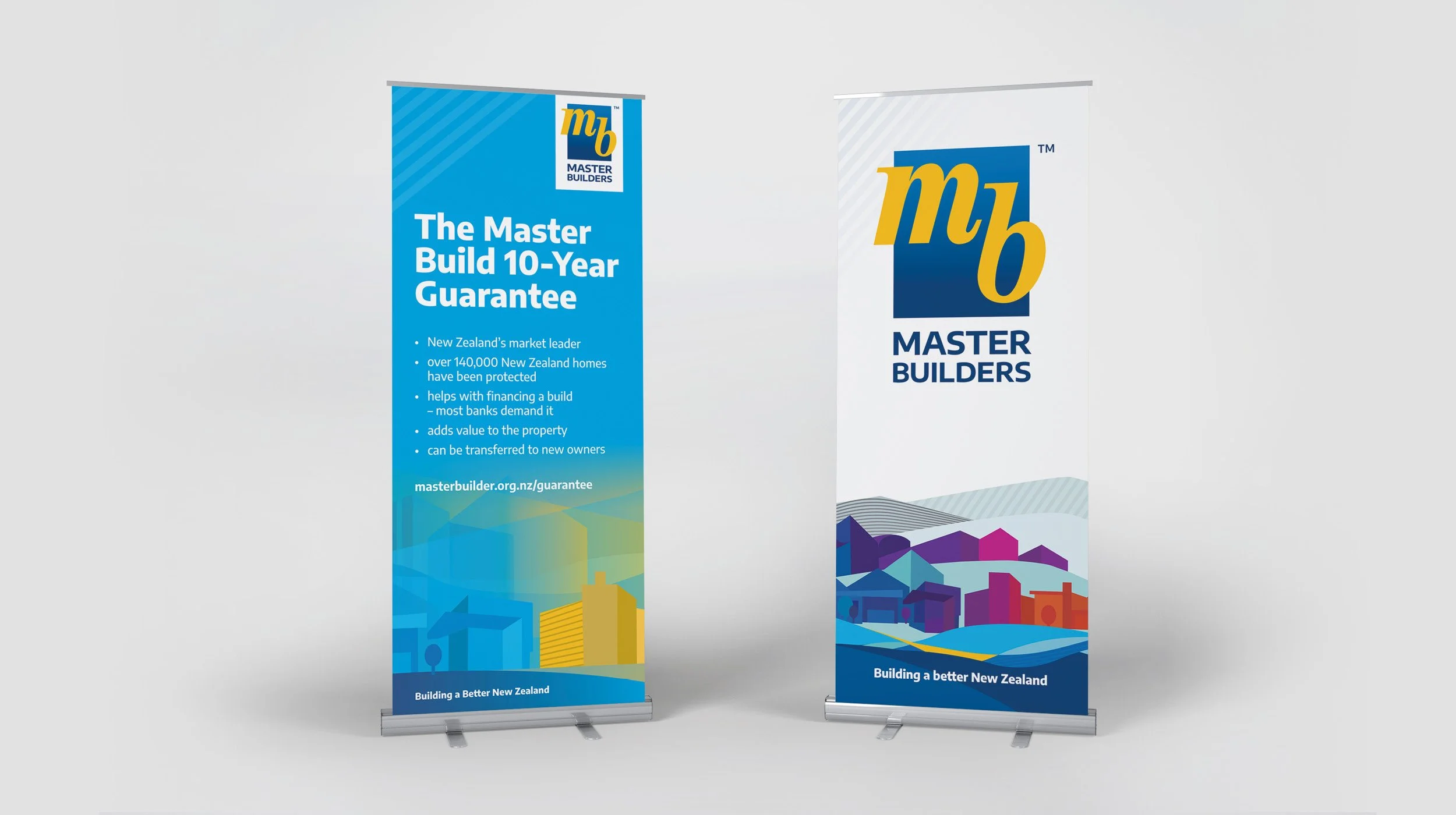
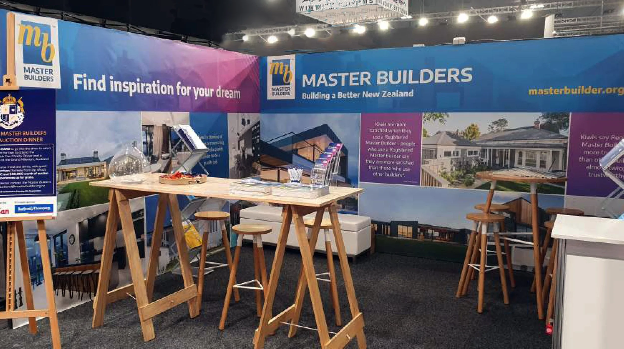
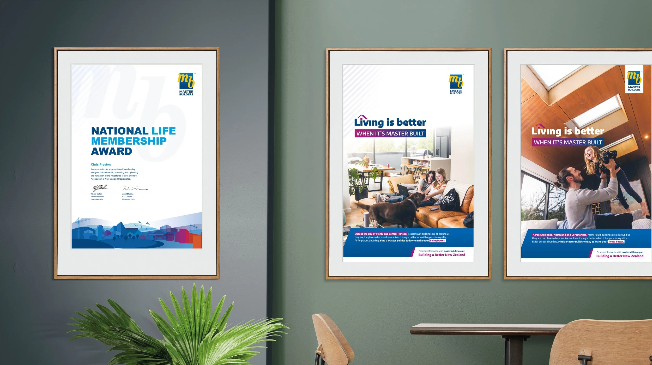
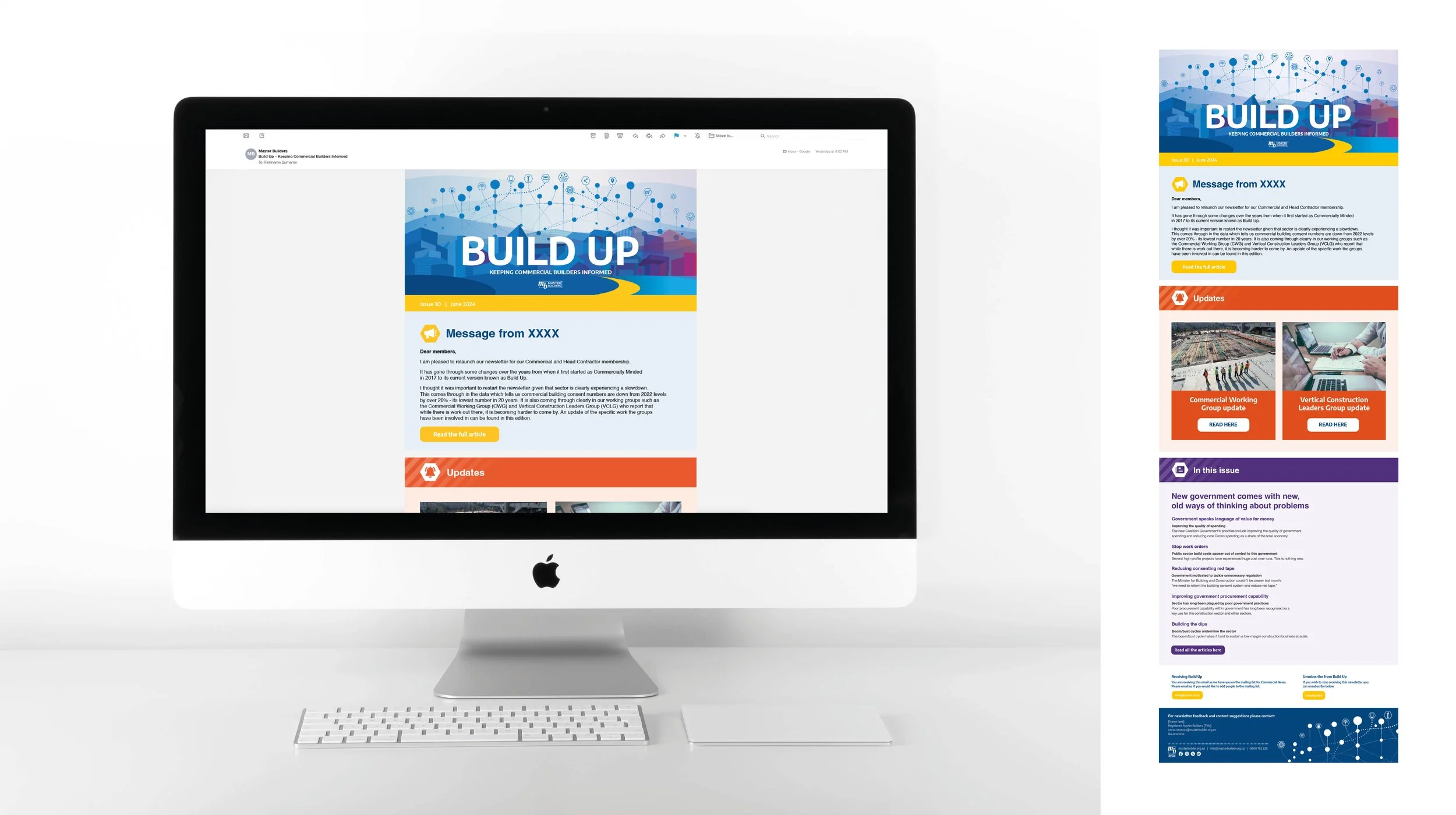
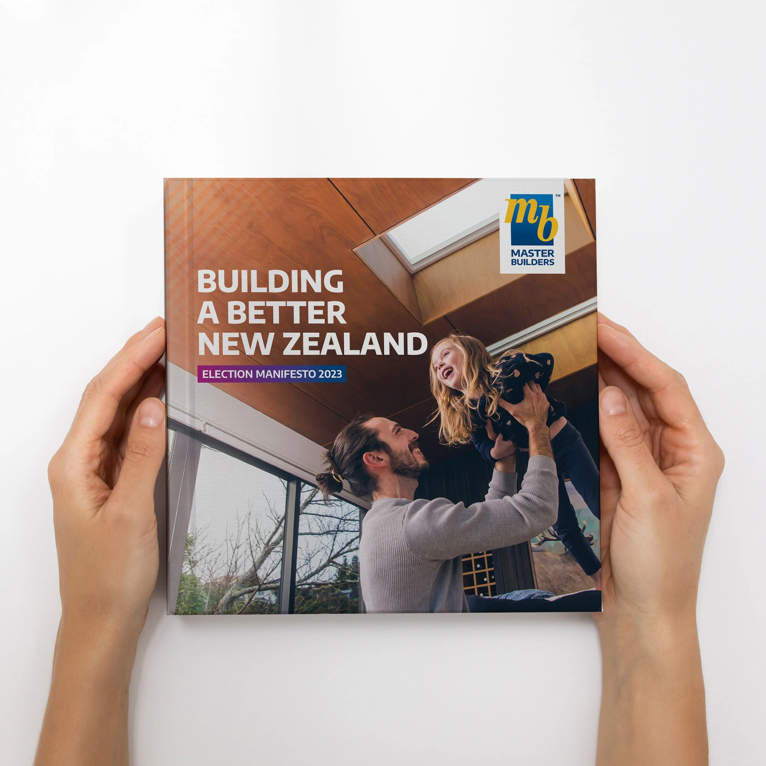
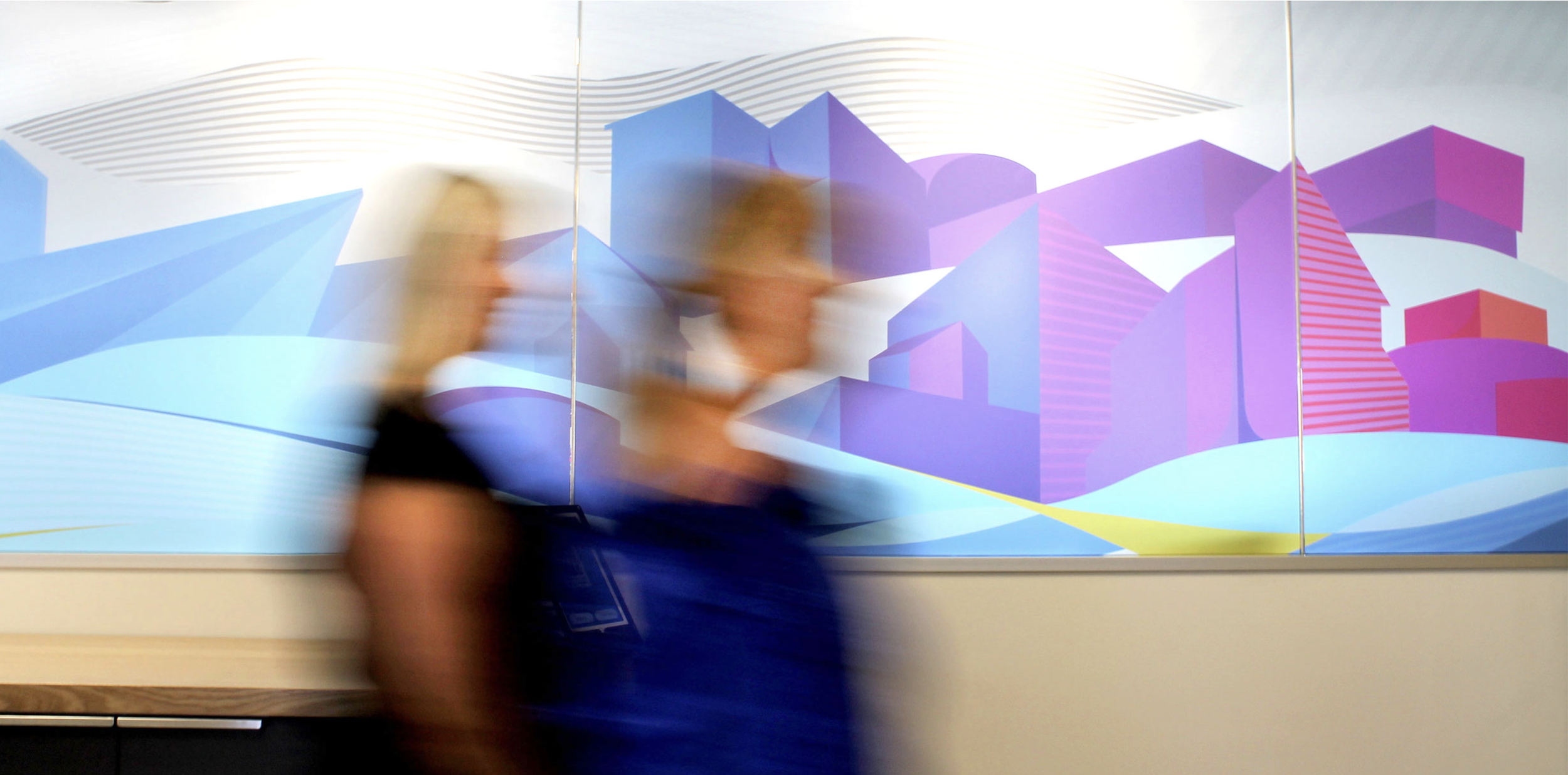
To support the organisation’s new positioning line ‘Building a Better New Zealand’, we created a series of colourful graphic textures which could be applied across print and digital material as well as vehicle and office signage.
We also created a short explainer video for members explaining the changes to the brand.
Outcomes
The refined logo connects strongly to previous iterations while being more modern and fresh – and appropriate for an organisation and a brand that is going from strength to strength.
Master Builders has a number of highly recognisable sub-brands (and multiple audiences). We oversee these, ensuring each achieves its own communications goals while keeping the bigger picture in mind to ensure that each supports the strong quality proposition that is the Master Builders brand.