

‘an intentionally simple strategic approach to support wellness’
Multichannel brand – Health New Zealand Te Whatu Ora
About
In 2022, we were asked to develop the interim logos for Te Whatu Ora – Health New Zealand and Te Aka Whai Ora – the Māori Health Authority. Our remit was to develop a simple brand for a more coordinated and effective health system that will support all New Zealanders to live better and longer.
Guided by Dan Brown (Maōri Strategist) we extended the gifted names into two clean, understated identities that work well independently and together.
Both identities tell a unique story.
Approach
Te Whatu Ora is ‘the weaving of wellness’ – bringing strands together to weave a basket; a basket of life. Our tohu consists of a Tāniko (border) with hanging strands below it, which are both full of symbolism.
The identity for Te Aka Whai Ora is inspired by Te Waka Hourua – the double-hulled canoe. For the logo, the two ‘V’s (which create the ‘W’ in the logo) represent the two sails from a double-hulled waka that drive us forward in unison. The tohu represents Te Hau (the wind/Tāwhirimātea) – as the wind creates the momentum that enables us to move forward. The beautiful, purple-based pastel shades that appear in the sky after dawn also reflect this new era – emerging into the world of light/living.
Outcomes
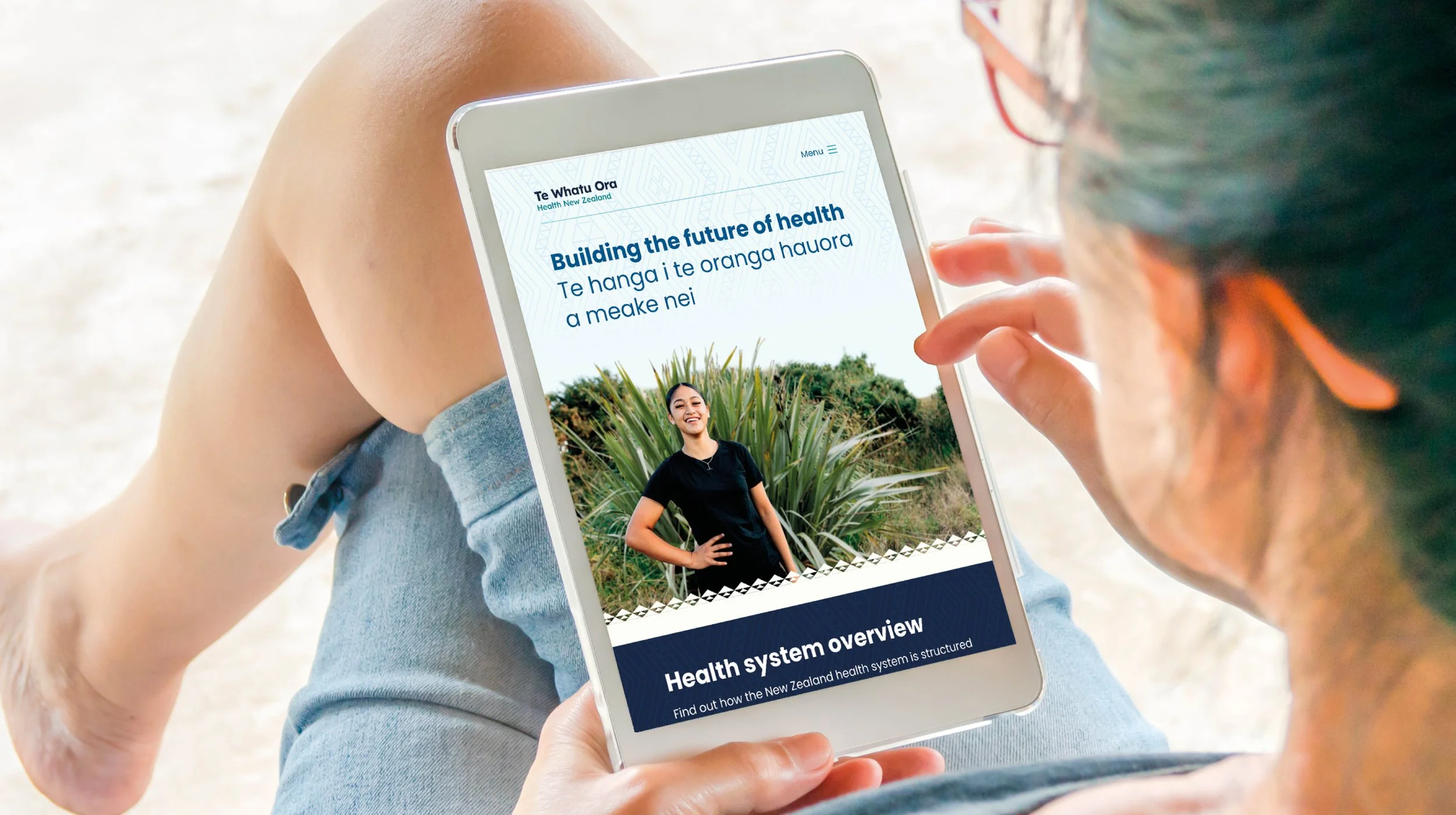
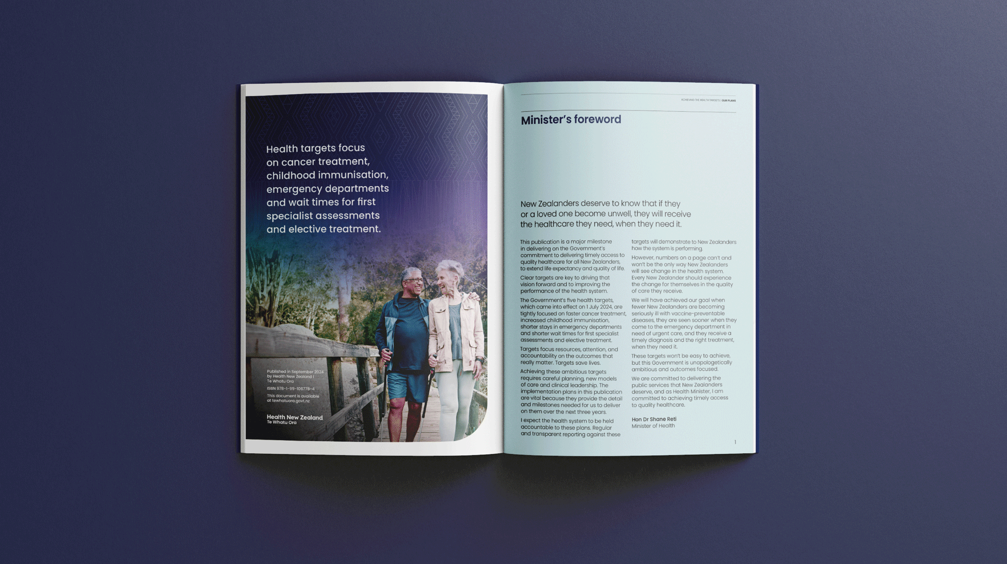
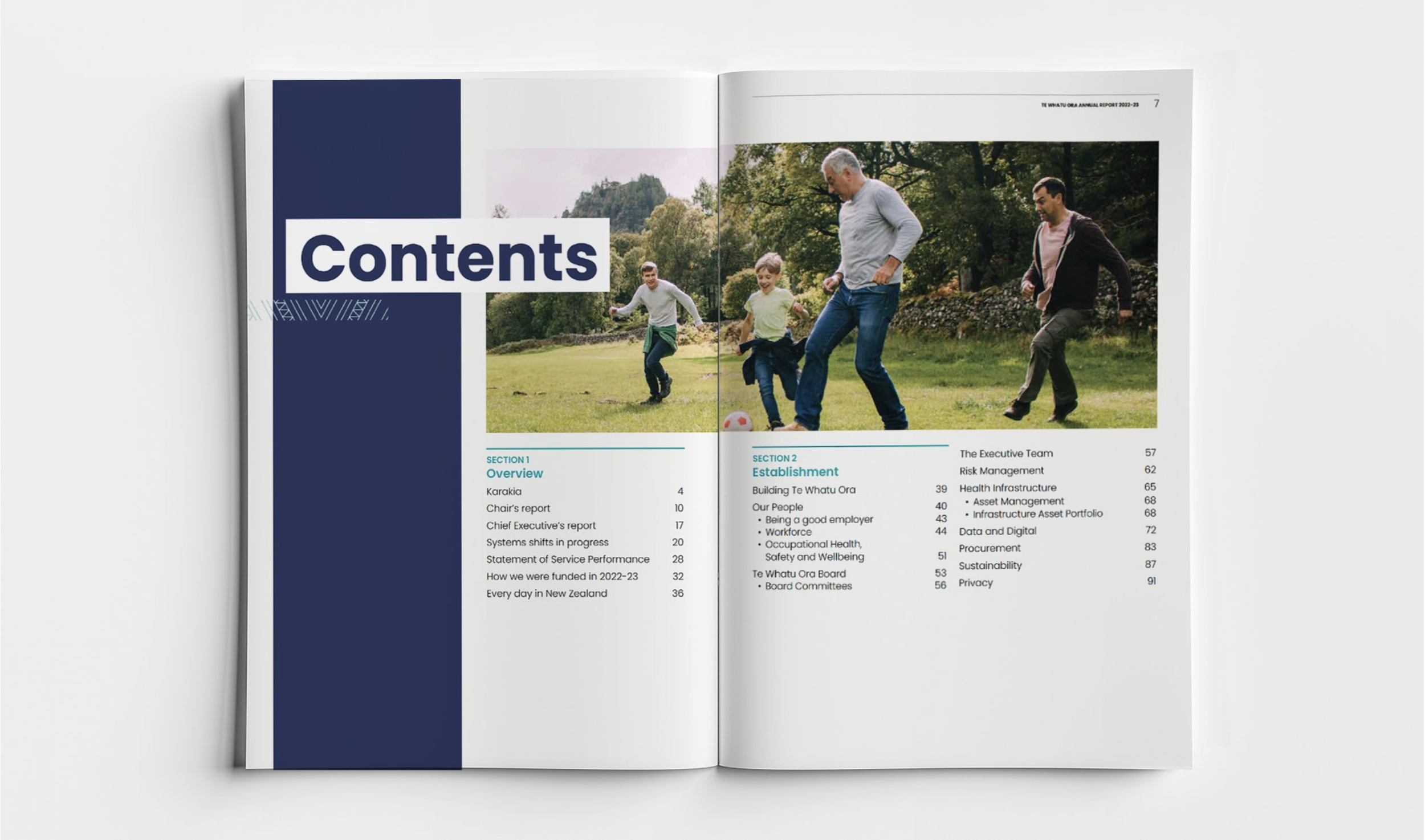
Intentionally simple (consisting of only a logo and a tohu for each entity), these interim logos were well received and appropriate (professional, understated and cost-effective to create and apply).
With simple and clear styles that are easy to follow, they define Health New Zealand as professional but not flashy – an organisation whose priorities are in delivering healthcare to New Zealanders.
This simple approach has paid off. More recently the brand was evolved in-house and we’ve had the opportunity support the roll-out in a variety of applications, such as technical reports and statutory reporting documents.


Te Aka Whai Ora


