‘future focused
for today’
Identity development – Hot Climate Partnership
About
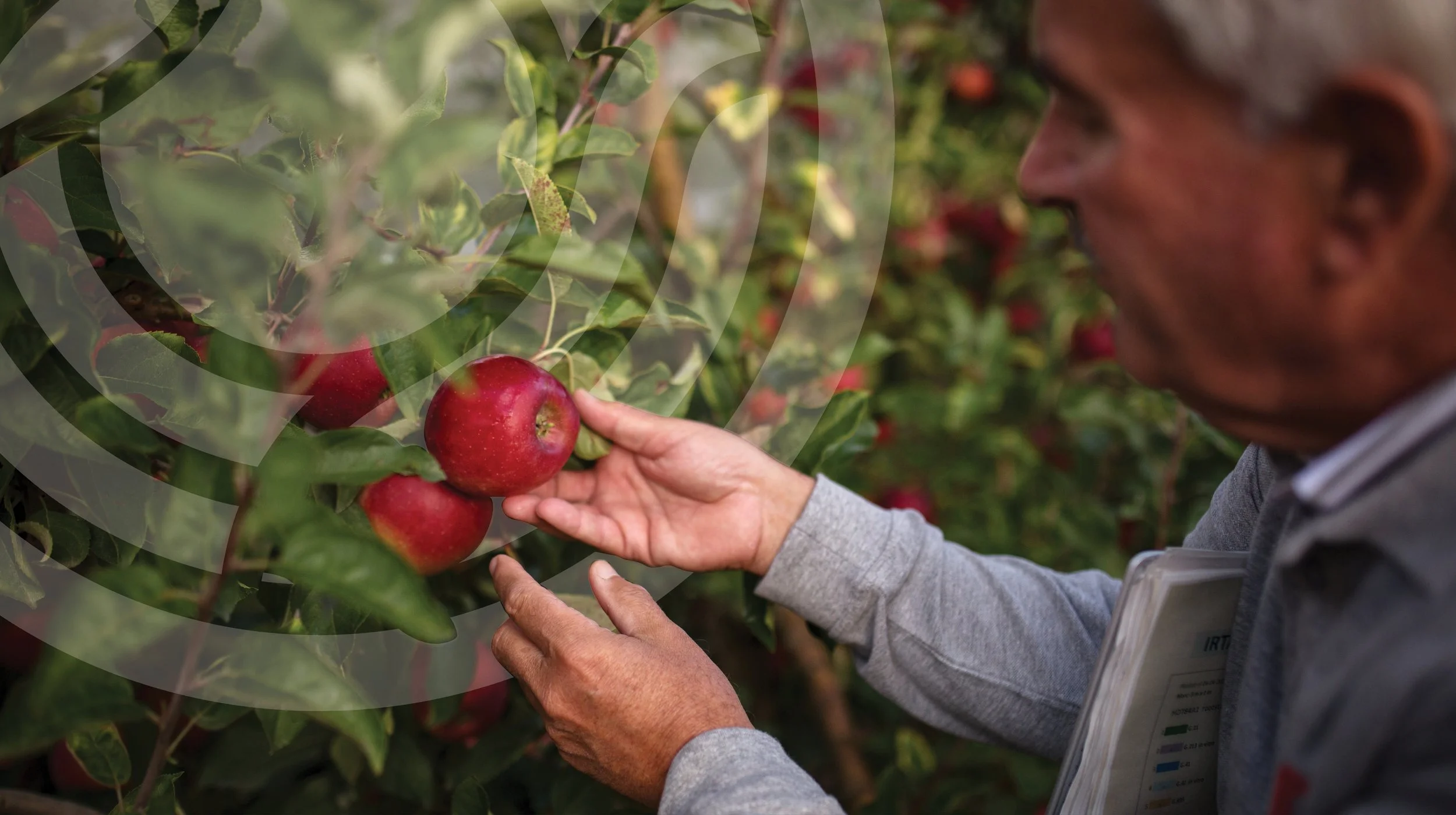
It’s heating up, and one of the biggest challenges in our warming world is ensuring the continued availability of high-quality produce. For over 20 years, the Hot Climate Partnership – between entities in Spain and New Zealand – has been developing apple and pear products specifically designed to thrive in hot and warming climates.
We were asked to bring the initiative to life, creating a new logo and a brand that reflects the work the partnership does.
Approach
Building on valuable insights from the initial strategy work, we delved deeply into the drivers behind the Hot Climate Partnership – its holistic, interconnected nature, the hot and cool aspects of the environment in which they operate, and, of course, the apple and pear products they develop.
The result was a circular logo marque, paired with bold typography and supported by vibrant brand textures based on the shapes within the logo itself, designed for use across a wide range of applications. From there, a robust, fresh and confident brand emerged.
Outcomes
The result is a professional, corporate brand for an international partnership based on advanced scientific expertise. One that provides a platform to support – but does not compete with – the launch of public-facing retail product brands (such as STELLAR™), which are the outcomes of the partnership’s work.
The brand has helped raise the visibility of the partnership at conferences and product launches, as well as serving as a vehicle to recognise the organisations behind the end products that have emerged from its work.
The brand is well-regarded by team members, as evidenced by the Hot Climate Partnership pins worn with pride.