
Te Whatu Ora - Health New Zealand and Te Aka Whai Ora - Māori Health Authority
In 2022, we were asked to develop the interim logos for Te Whatu Ora – Health New Zealand and Te Aka Whai Ora – the Māori Health Authority. Our remit was to visualise a more coordinated and effective health system that will support all New Zealanders to live better and longer.
Guided by Dan Brown (Maōri Strategist) we extended the gifted names into two clean, understated identities that work well independently and together.
Both identities tell a unique story.
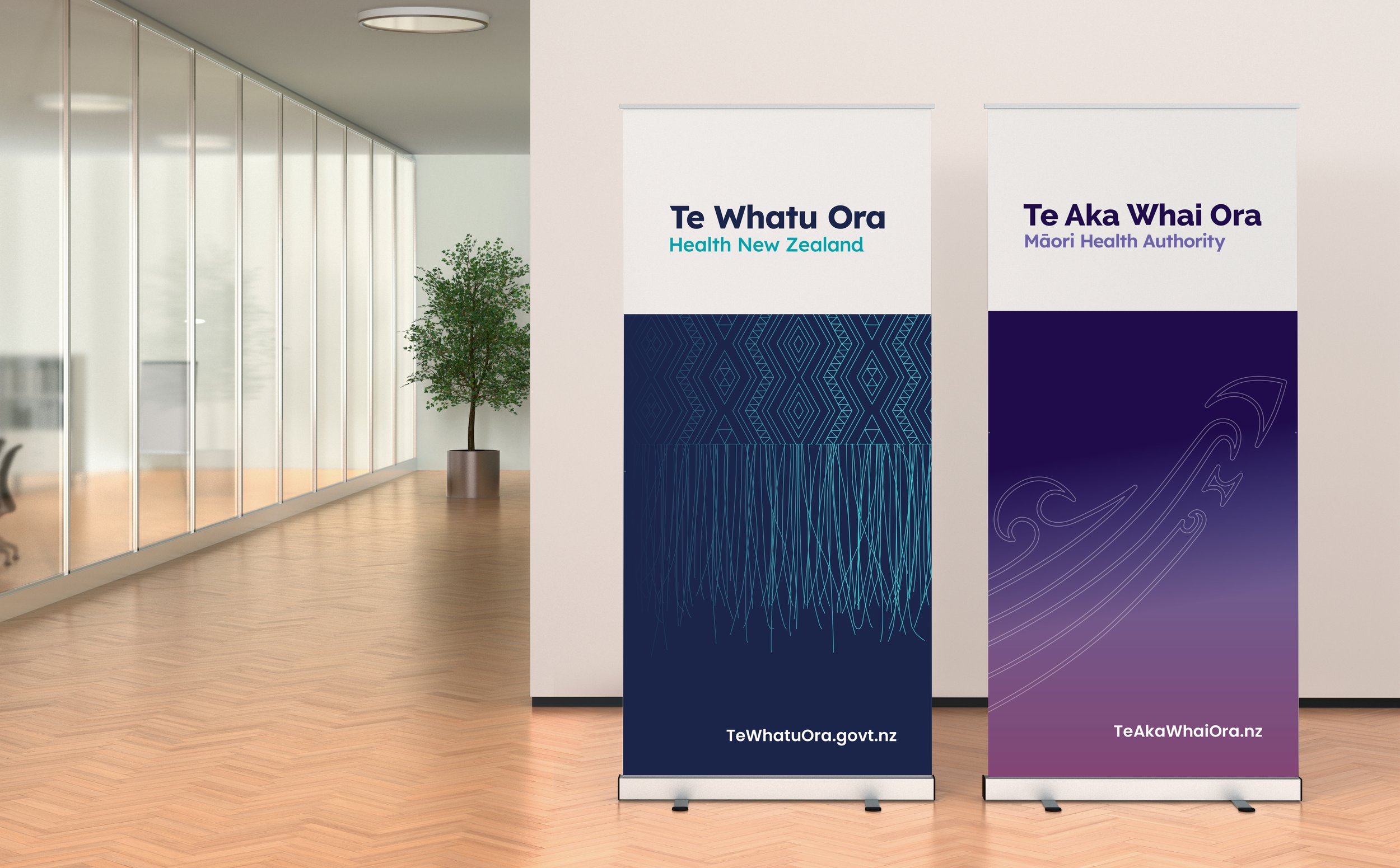
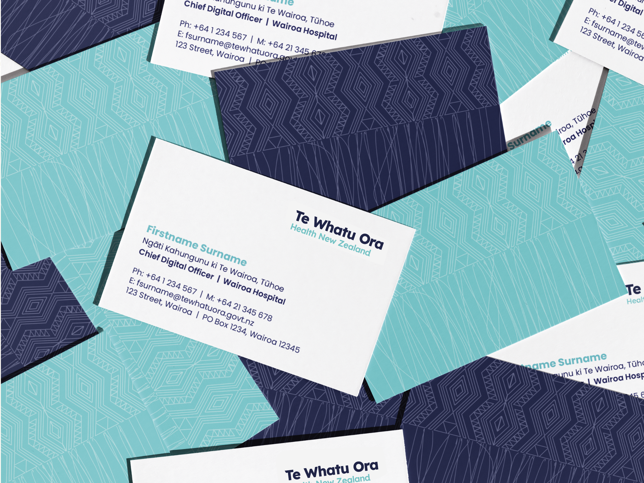
Te Whatu Ora is ‘the weaving of wellness’ – bringing strands together to weave a basket; a basket of life. Our tohu consists of a Tāniko (border) with hanging strands below it which are both full of symbolism.
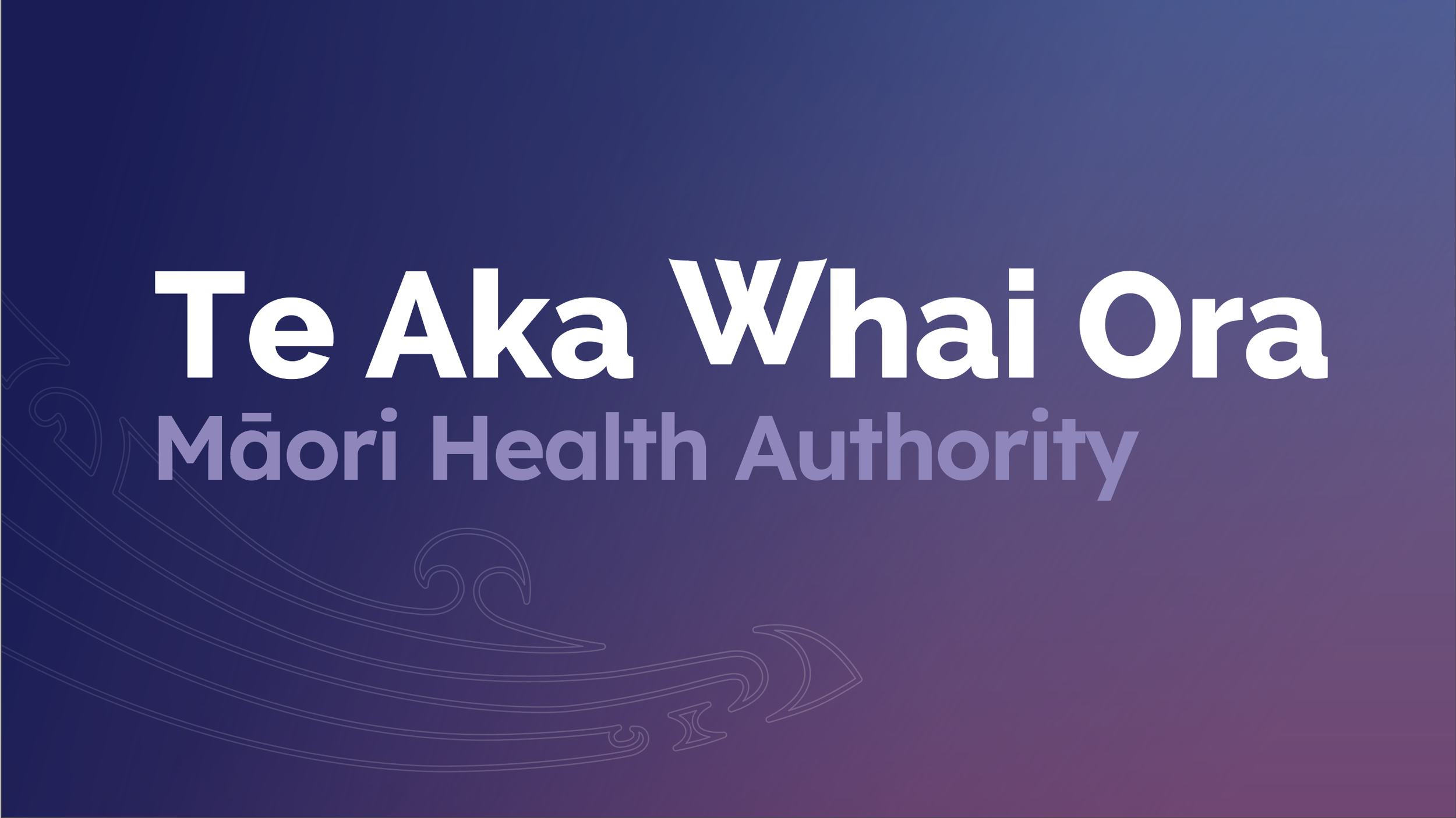
The identity for Te Aka Whai Ora is inspired by Te Waka Hourua – the double-hulled canoe. For the logo, the two ‘V’s (which create the ‘W’ in the logo) represent the two sails from a double-hulled waka that drive us forward in unison. The tohu represents Te Hau (the wind/Tāwhirimātea) – as the wind creates the momentum that enables us to move forward. The beautiful purple-based pastel shades that appear in the sky after dawn also reflect this new era – coming out into the world of light/living.
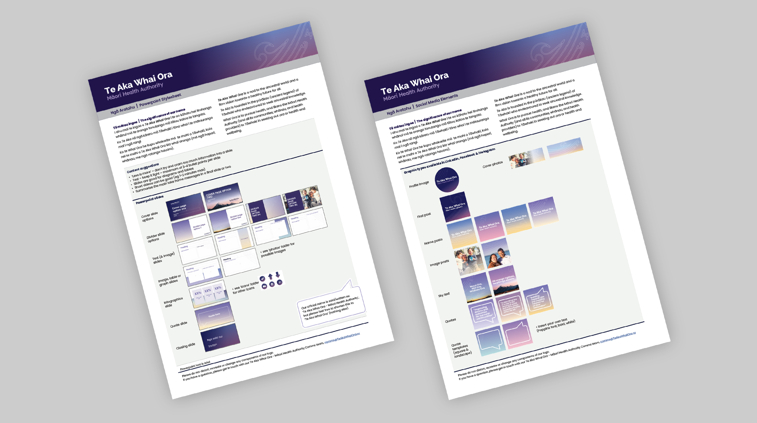
Intentionally simple (consisting of only a logo and a tohu for each entity) these interim logos were well received and appropriate (professional, understated and created quickly without the usual extensive brand process). Perfect for the brief.
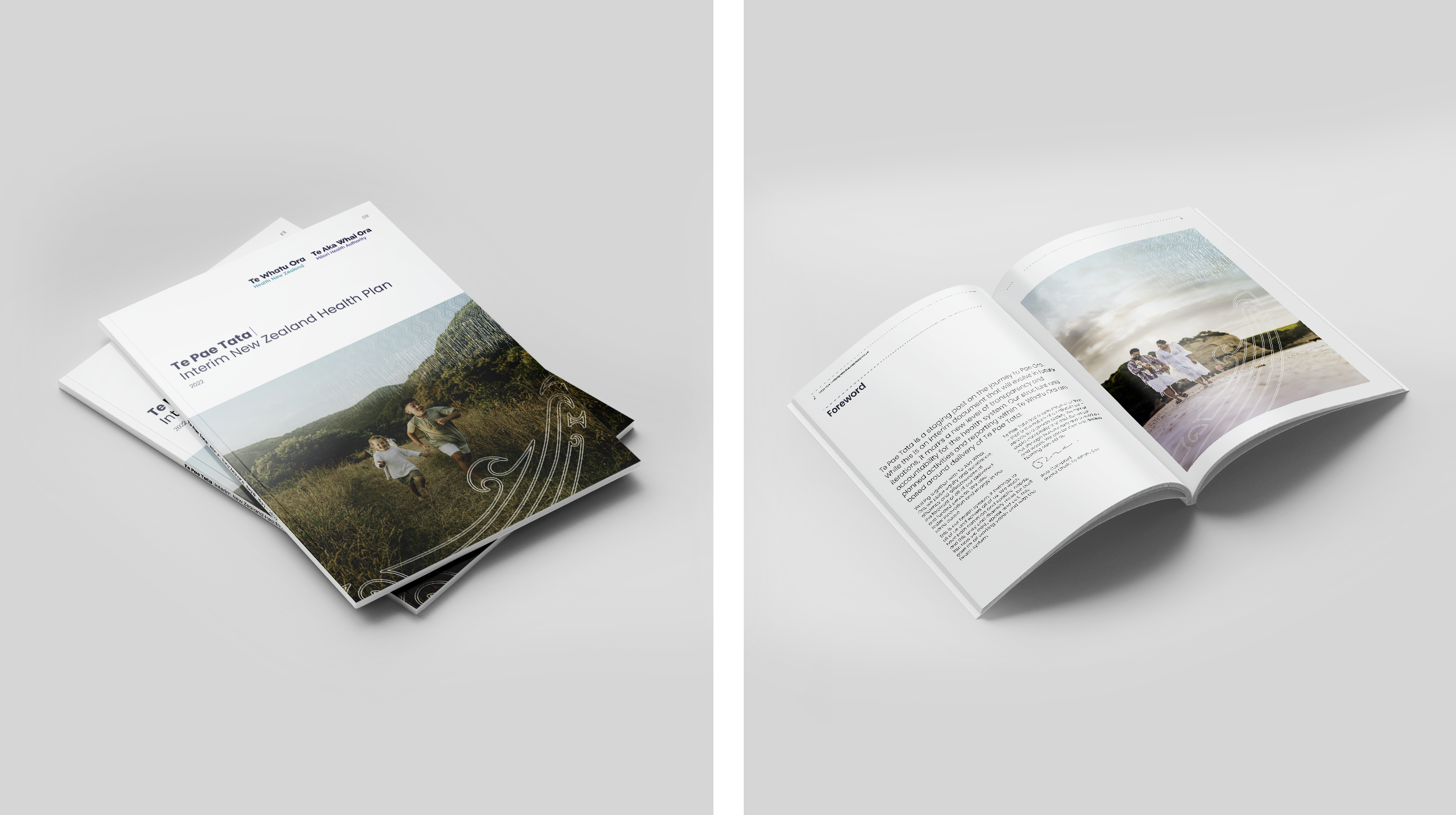
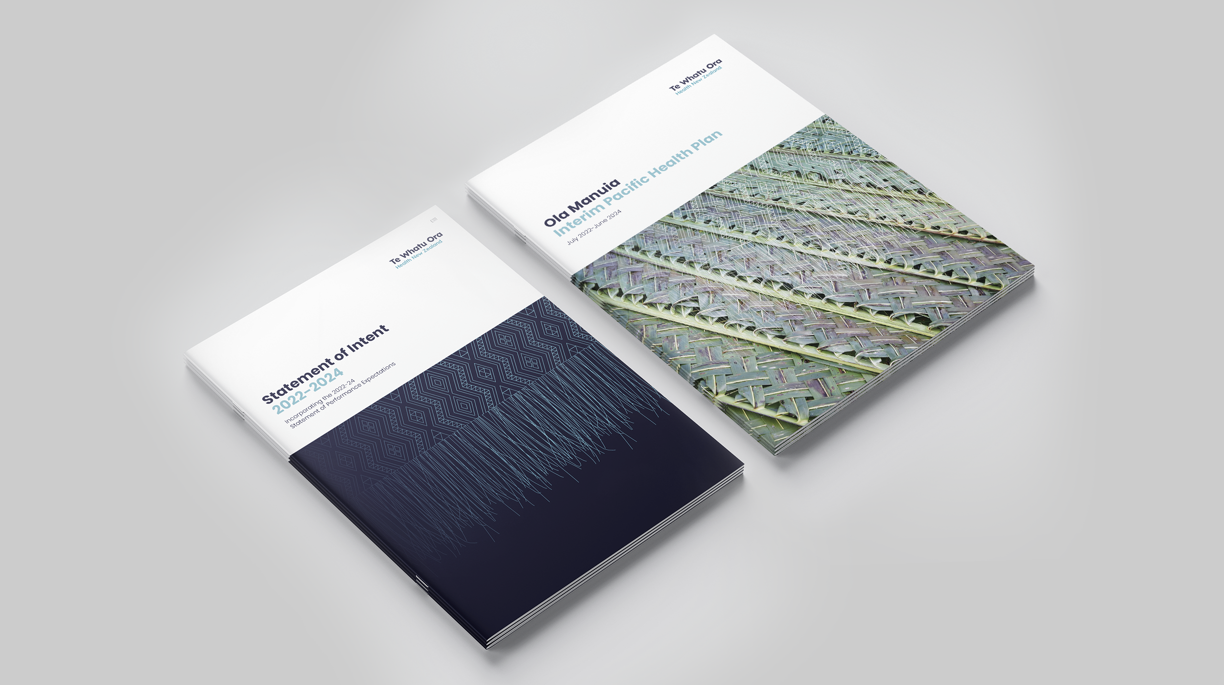
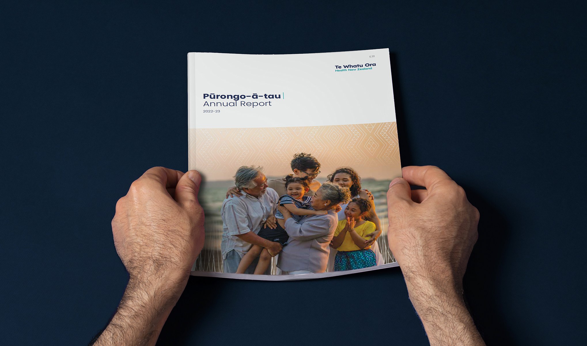
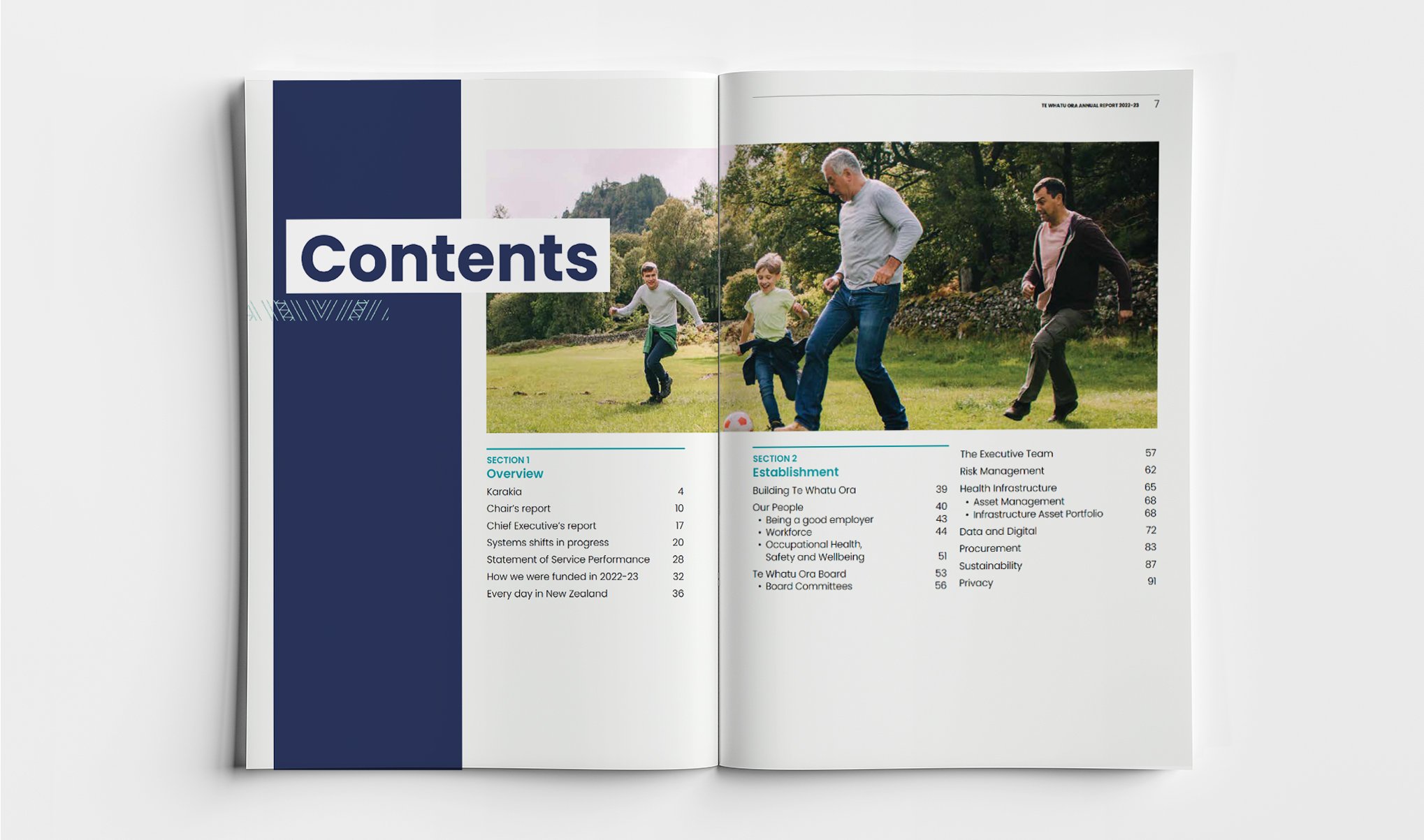
More recently, we have been activating the brand through various collateral, including Policy and Standards reports, Clinical Practice Guidelines, and the 2023 Annual Report. These high-profile publications have allowed us to showcase the brand’s range and flexibility. We always ensure that accessibility and ease of navigation are top of mind..